Adapting to Modern Needs: Jon Cummings Architecture’s Toronto Laneway Workshop
Toronto Laneway Workshop by Jon Cummings Architecture explores the intersection of functionality, sustainability, and urban adaptability in Toronto’s laneway landscape. Designed as a hybrid space that combines a home office, bike repair station, storage, and outdoor gathering area, this compact structure reflects the evolving needs of modern homeowners post-pandemic.
With a focus on low-carbon materials, thoughtful detailing, and innovative zoning solutions, the project demonstrates how small-scale architecture can serve as a catalyst for more flexible and sustainable urban living. Join us as we delve into the story behind this multifunctional space and its role in shaping the future of Toronto’s laneways.
Photography by Scott Norsworthy, Published with bowerbird
For other laneway and terrace houses on tinyhousezine.com see here
Jon Cummings Architecture has built a reputation for designing thoughtful, functional spaces. Could you tell us about the origins of your practice and your overarching design philosophy, and how these principles guided the “Toronto Laneway Workshop” project?
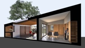
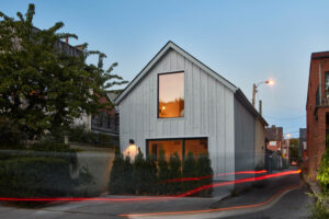
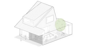
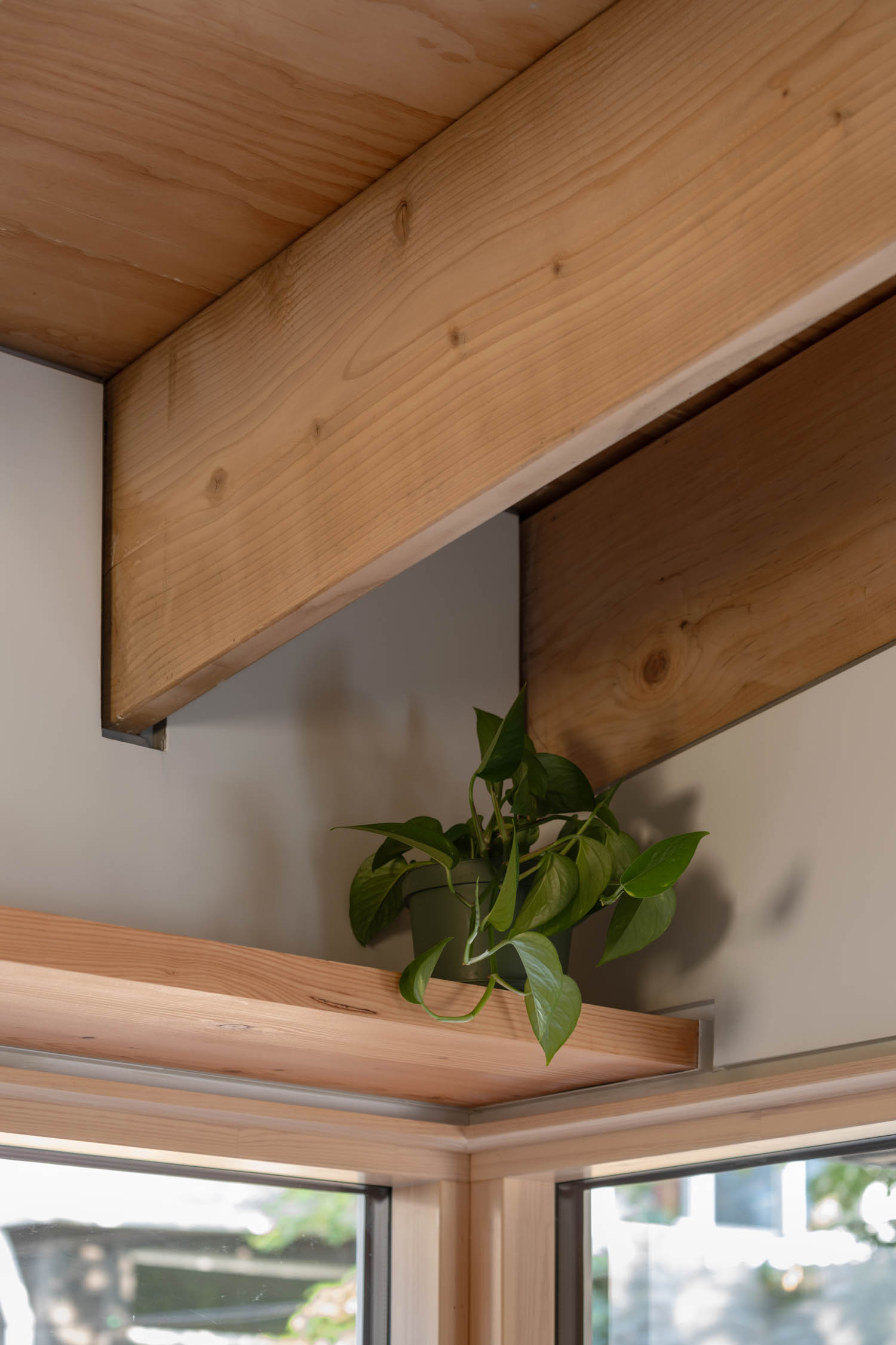
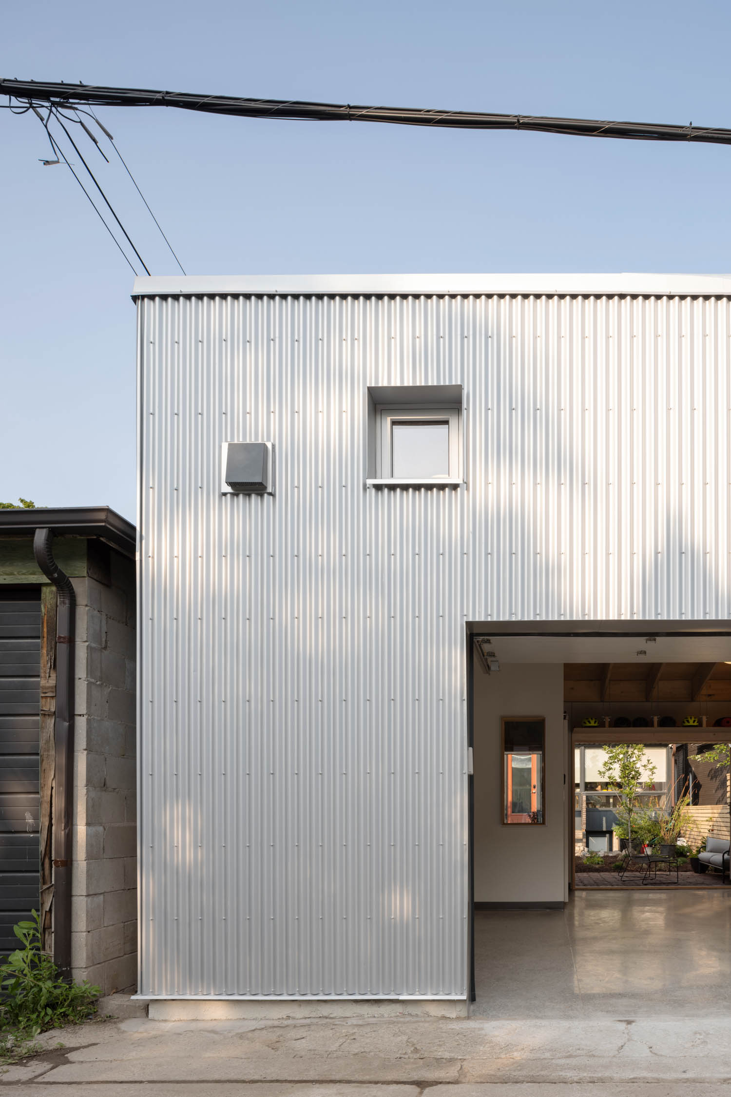
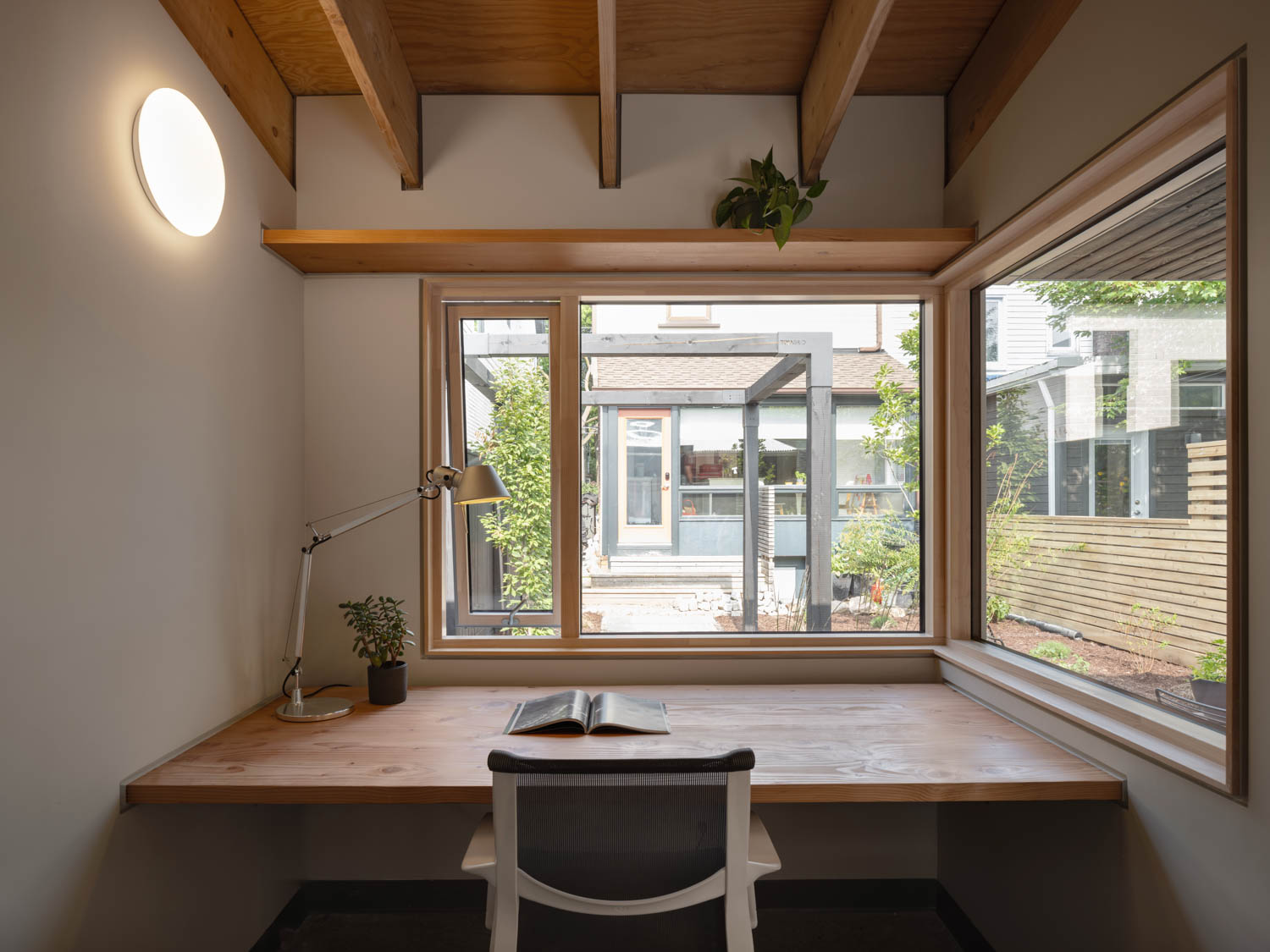
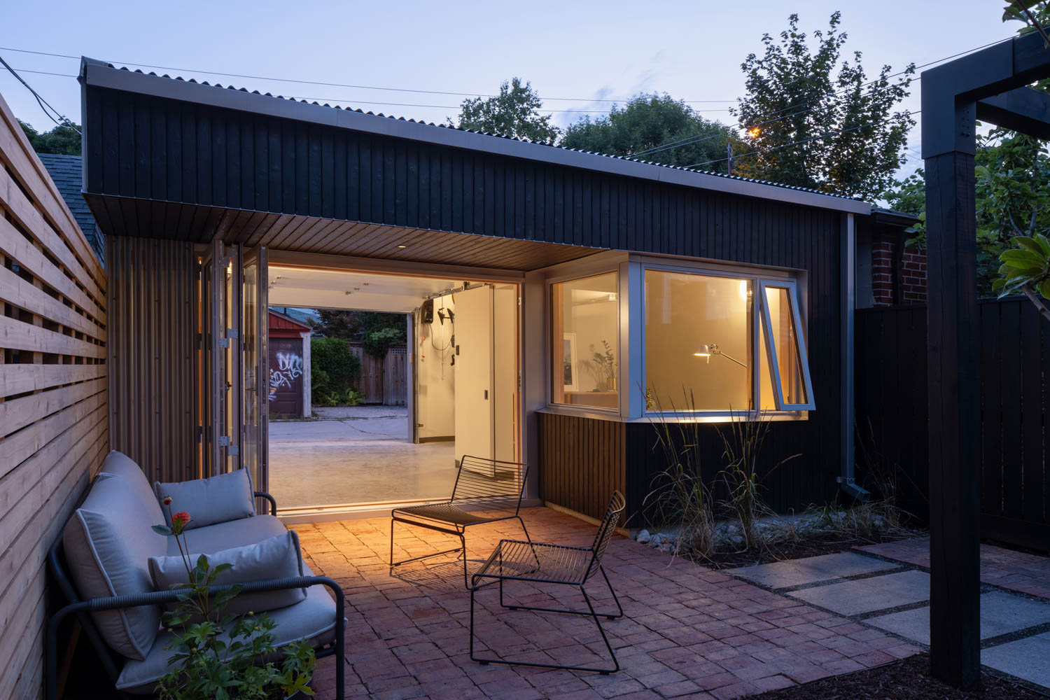
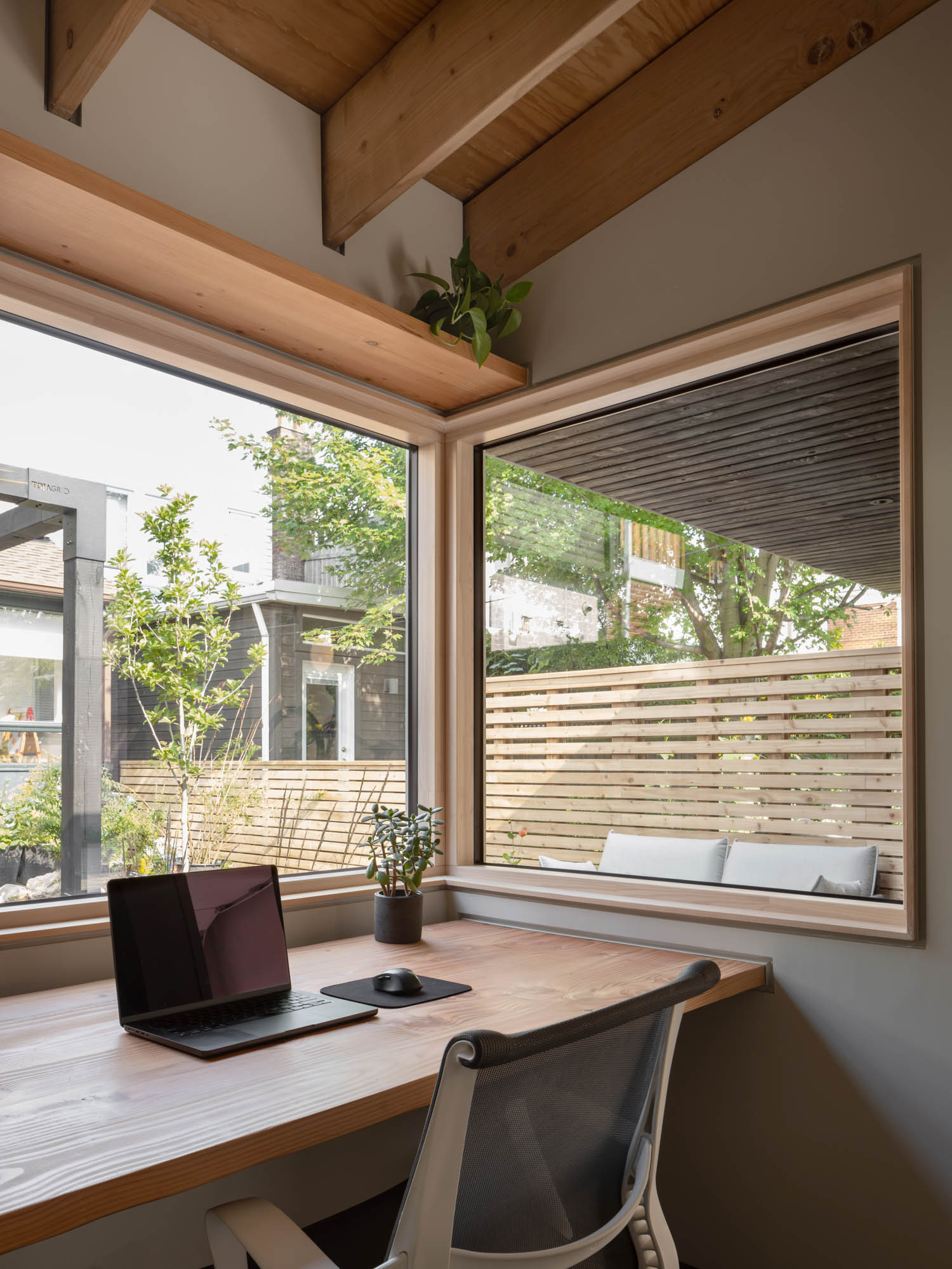
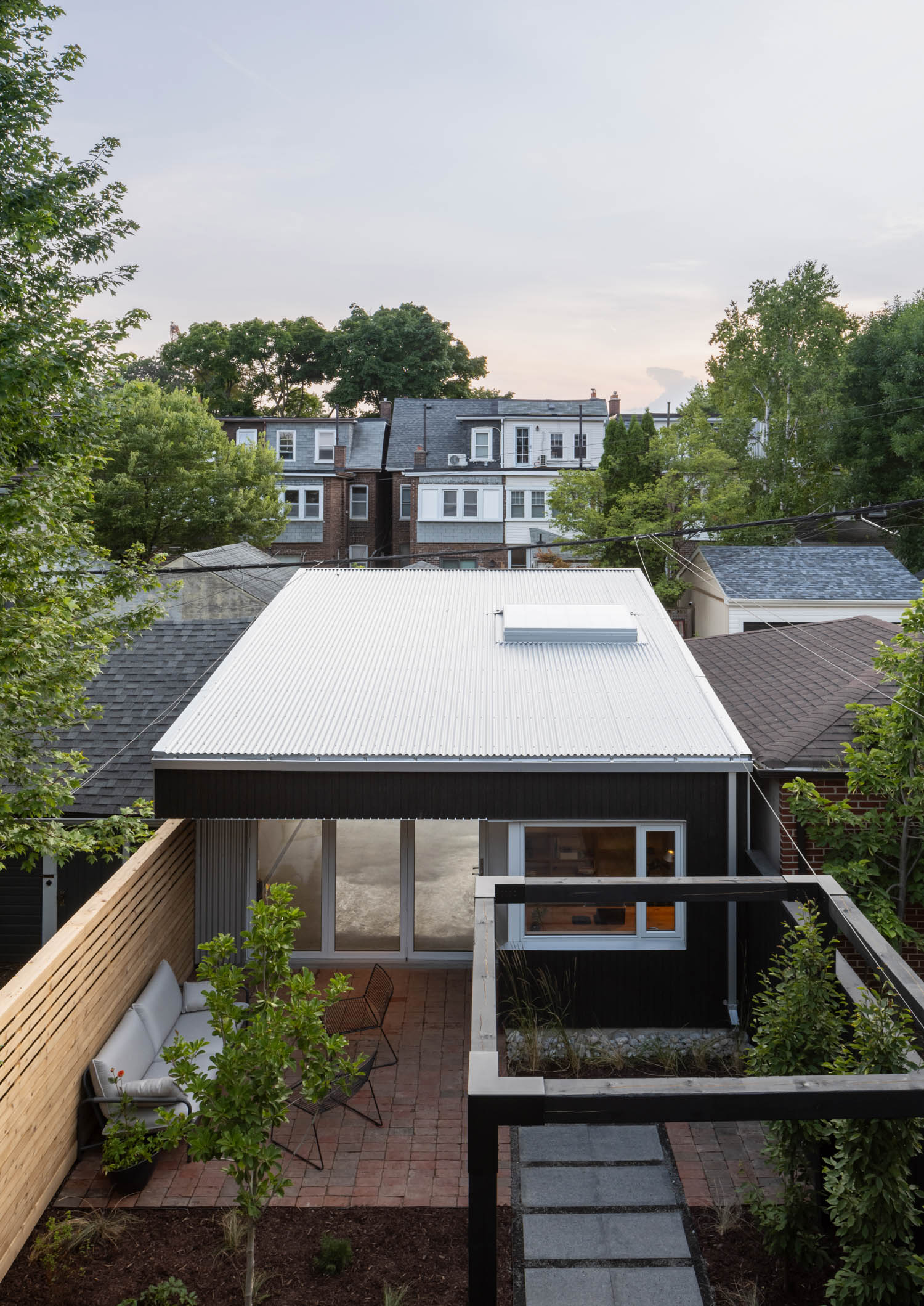
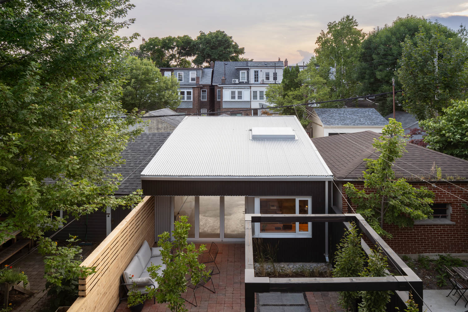
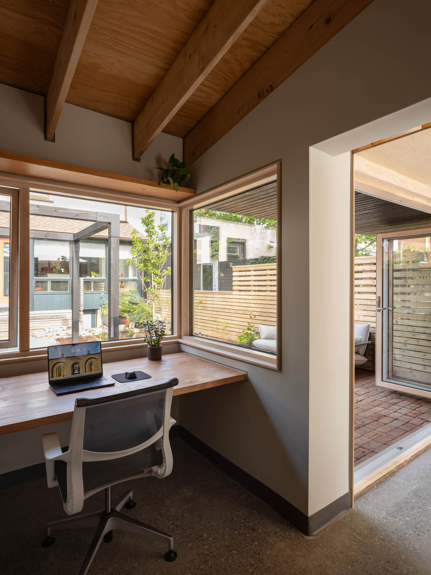
Our work is best understood as a meditation on architectural language. More broadly, the Venn diagram of JC-A’s approach would be the confluence of type, site, syntax, low carbon + recycled materials, and expressive environmental systems. Our goal is to mix these to hopefully create novelty and demonstrate a position on what architecture ought to be in this time and place. In the Toronto Laneway Workshop, some of this comes out in materials and effects. It’s wood frame construction, exposed with high insulation values above roof deck, choosing non-petroleum based insulation. Cladding facing the garden is charred local cedar. A skylight is an insulated translucent sandwich panel, rather than glass. Windows are made of wood. Shelving areas and built-in desks are a kind of bricolage in variously hardwood, softwood lumber, plywood and pipe hangers. In terms of language, the interest is riffing on modernist concerns; the dissolved corner window at the key moment in the office and a folding glass wall to the garden, the tiny square clerestory window on the sombre laneway elevation, translucent light filtered through exposed roof joists, the single slope shed roof with a cantilevered edge.
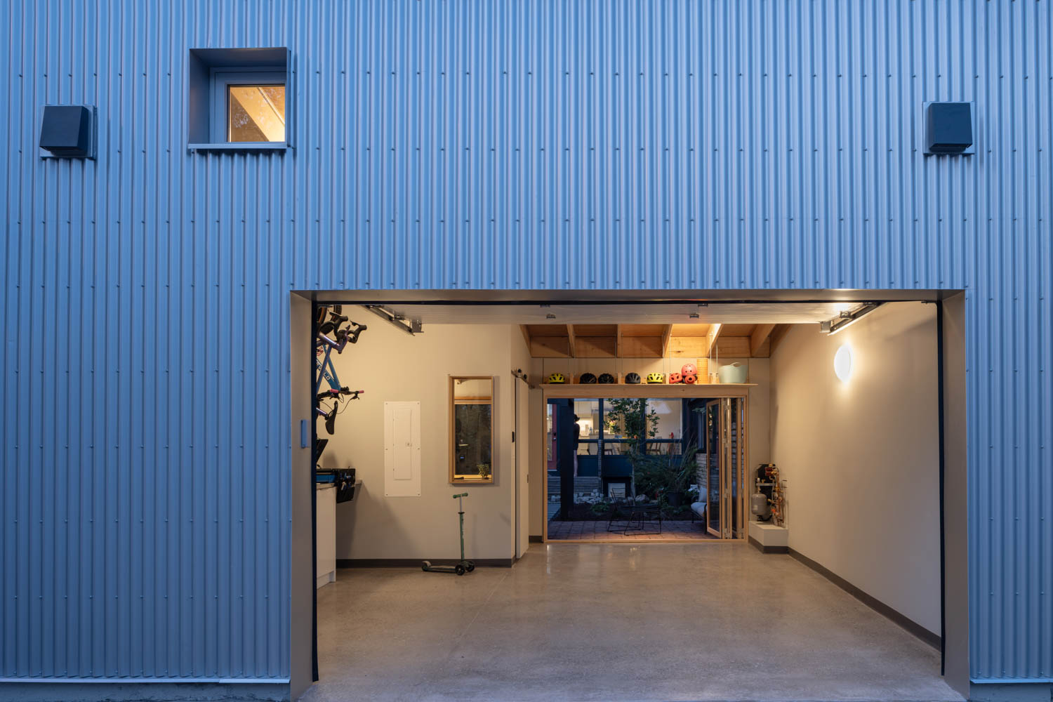
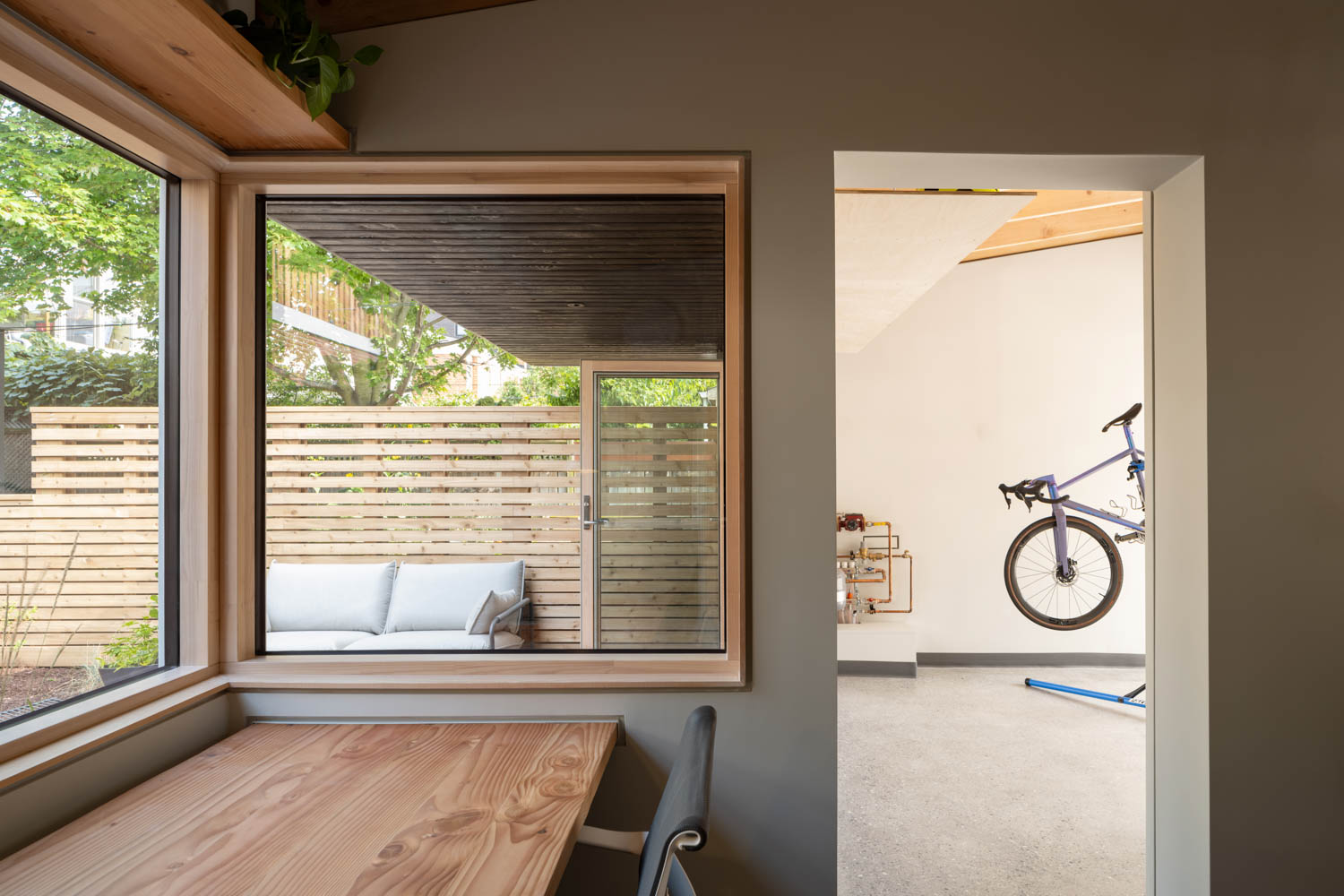
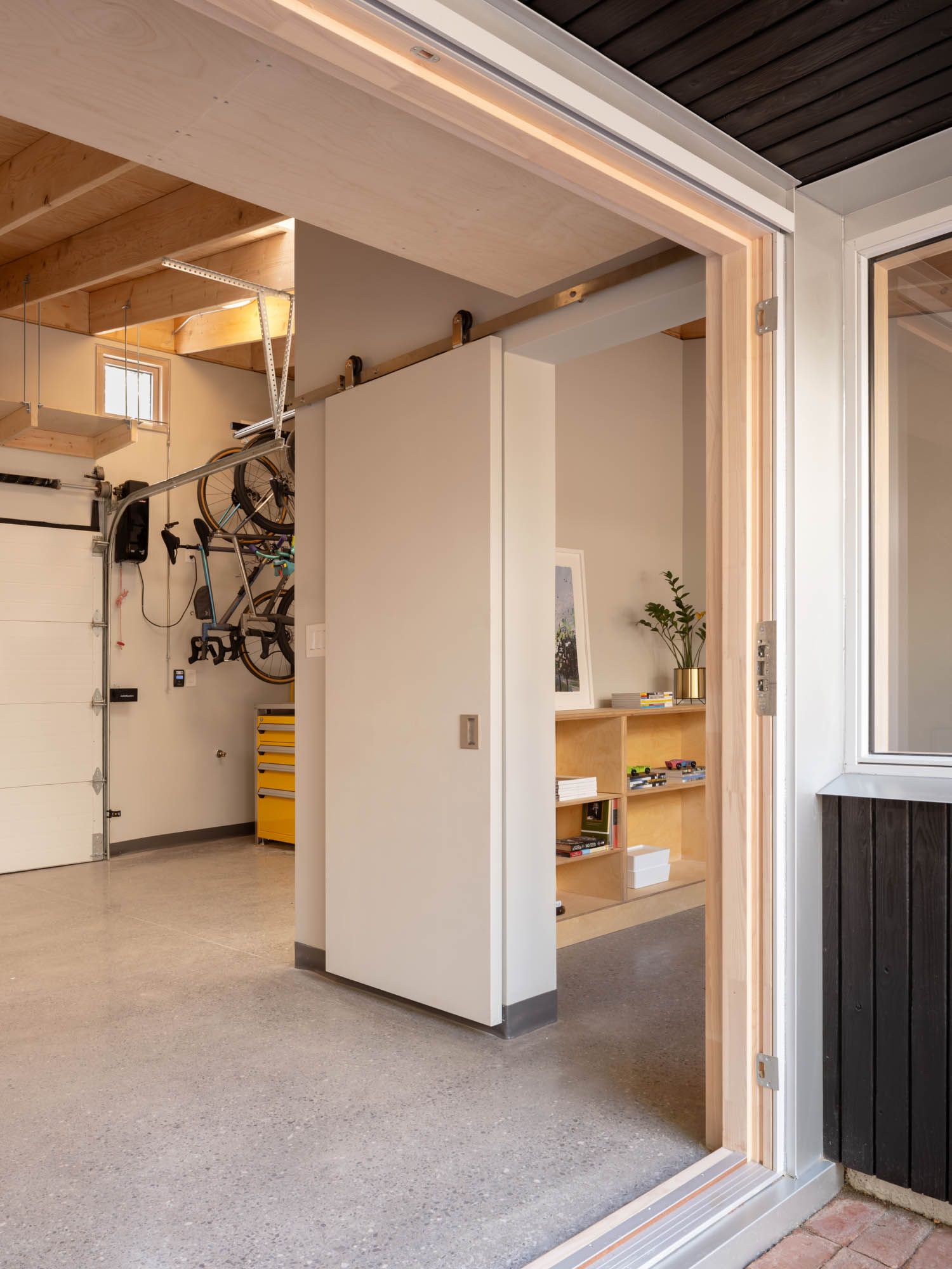
The “Toronto Laneway Workshop” project was born from the changing post-pandemic needs of the homeowners. Could you share how you approached balancing their diverse requirements—from a home office to a bike repair area—within the compact constraints of a laneway structure?
It was classic case of wants exceeding the buildable area and budget, so we just had to make compromises and find a balance. ie, the office could have been bigger to accommodate two people more comfortably, the bike storage area could have been bigger, more storage could have been created. We designed some built-in exterior seating, then cut it. A built-in desk got cut, then came back into the project in a different form. It’s sort of personal for any client – making decisions on what trade-offs work best for them. As a designer, your job is I think to listen, present options, and refine until everyone is happy.
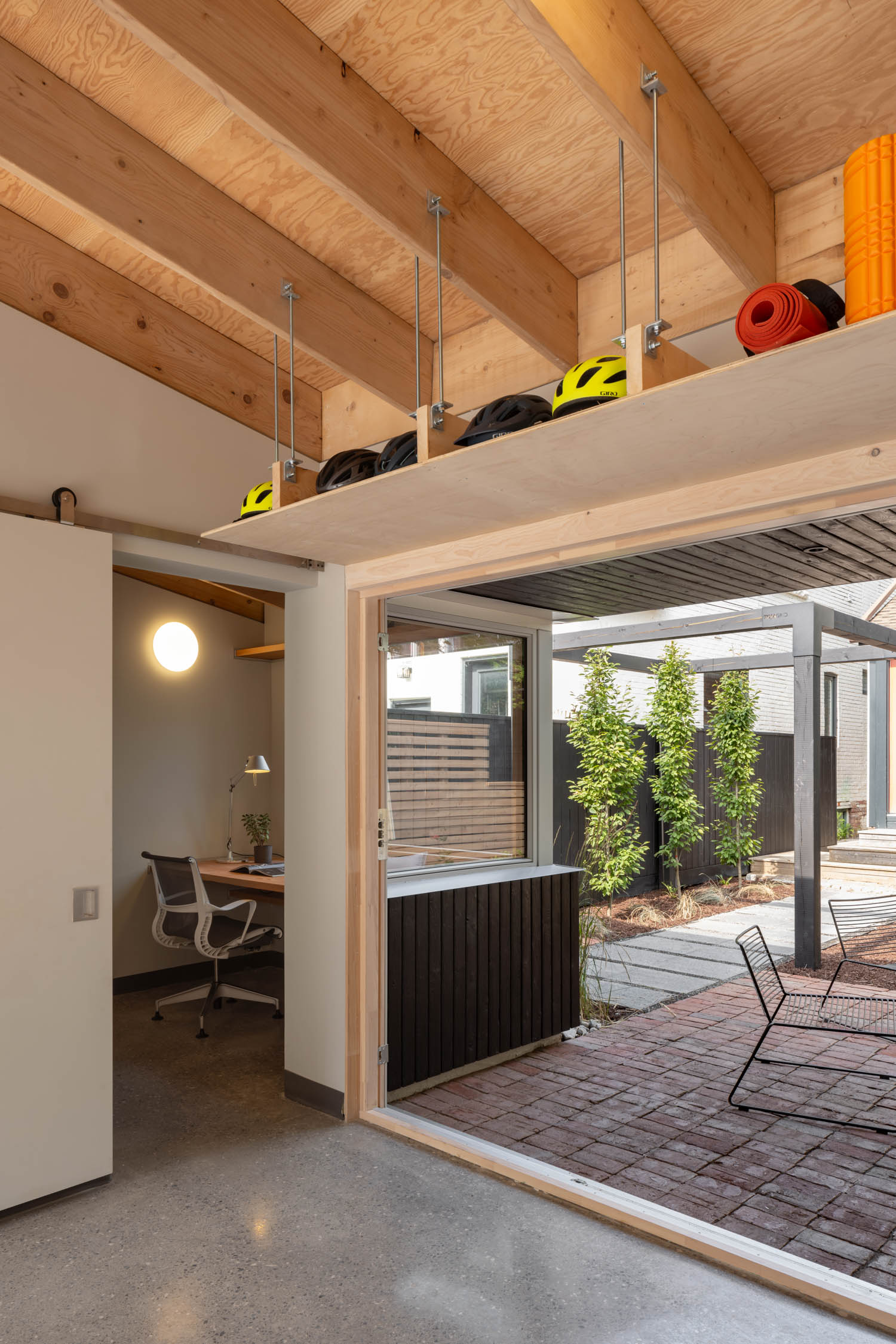
One of the homeowners is an architect with a busy schedule, yet they were closely involved in the design process. How did their input shape the final outcome, and how did you navigate the collaboration to ensure the project maintained a cohesive vision?
It started with the client having a number of sketch options that they wanted to explore, and initially the design process involved editing those down substantially and presenting a refined vision, taking some ideas and not others, and presenting different thoughts on shape, space, materials, composition. Like there was initially a planted roof with something like a ‘Ha-ha’ concealed landscape planter over the office that was cut as seemed like probably a move too-many. In some ways the client operated as an expert reviewer of design options as the project evolved. Some specific product references came from them. During construction, they were able to closely monitor the project for quality, and come up with sketches to particular site issues that came up. I think overall the design ended up in a place that it wouldn’t have if the architect were calling all of the design decisions, and I think it’s probably a much better project for that. In a way this happens with many clients. But probably more so here.
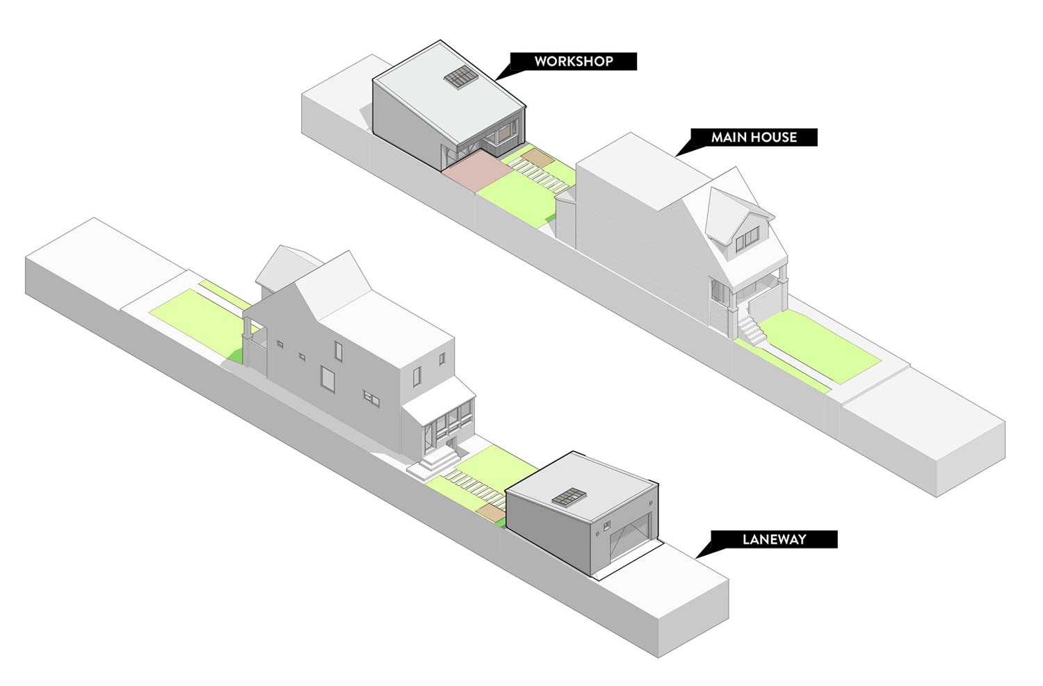
In terms of the zoning challenges you faced, how did the process of applying to the Committee of Adjustment for professional home office use impact the project’s design, and do you think this experience speaks to broader changes in how residential spaces are being used post-pandemic?
It’s an unfortunate holdover in our zoning by-law that prohibits non-residential uses on laneways. I think it was about keeping visitors out of neighbourhoods, keeping areas of the city exclusive. I expect other cities around the world have similar NIMBYism that prohibit these uses. In some ways it didn’t make any sense even pre-pandemic. Like if a psychologist or even an architecture firm wanted to have a small office in one of these accessory structures, it’s illegal, but if attached to the home, somehow that passed. Post-pandemic, the number of types of businesses that we could imagine wanting offices like this has multiplied. What’s specific to Toronto is that we have so many laneways as a result of how much of our city was laid out a century or more ago. So we really need to make this legal as-of-right. It’s an opportunity for a more meaningfully mixed-use city to grow.
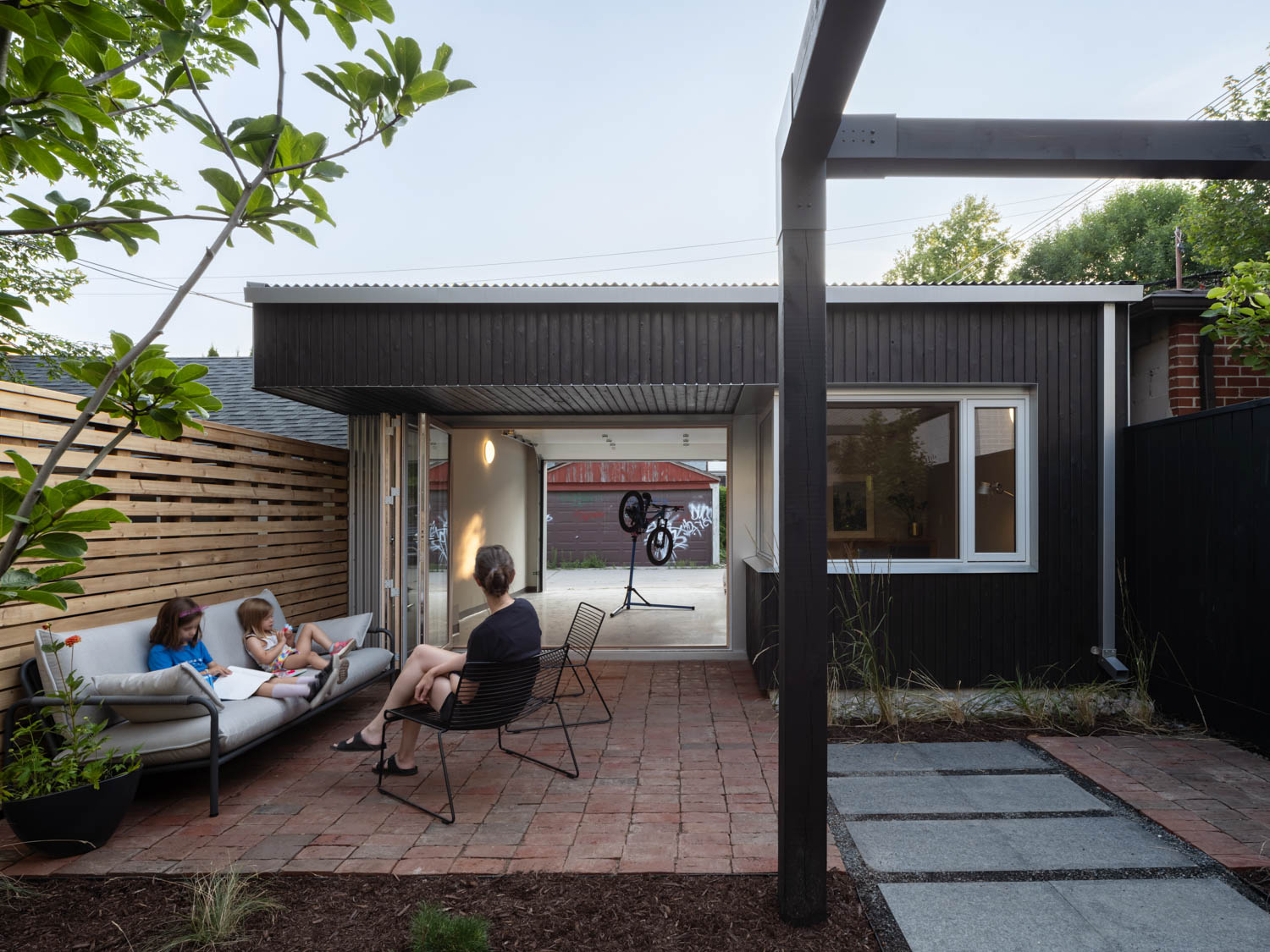
The laneway structure serves a multitude of purposes, from a garage and bike repair station to storage and a backyard gathering space. How did you ensure that these functional spaces worked together seamlessly while still maintaining a sense of aesthetic elegance?
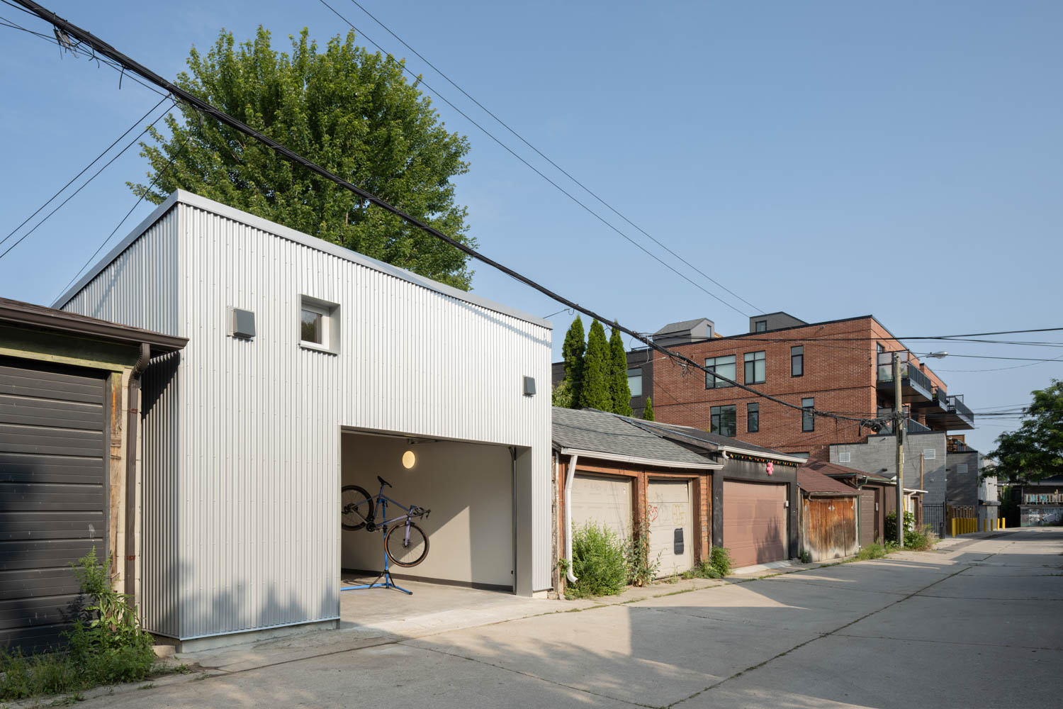
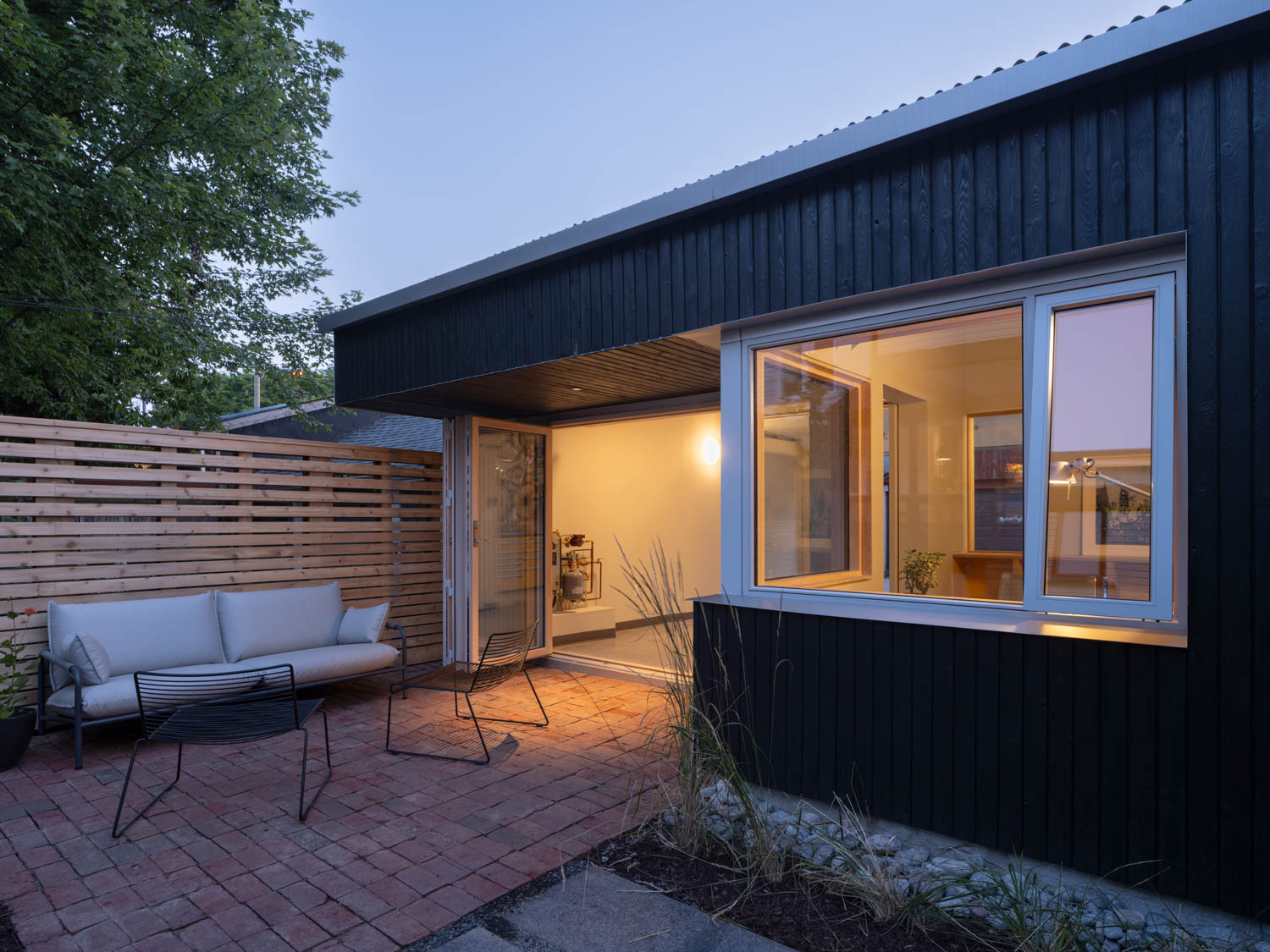
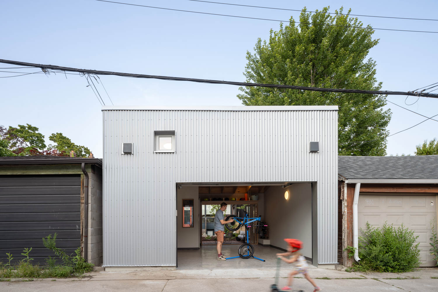
I think material and language pull it together. The silver corrugated metal roof, stainless steel bike repair workbench with integrated sink, exposed galvanized pipe rod, exterior cladding in silver on the folding doors and windows, etc. Wood does this too, exposed in different features from the roof joists to plywood shelves, wood windows, hardwood desk, interior trim. Then specific features pop to express a special purpose, like a yellow metal too box, reddish water-cut masonry pavers in the outdoor lounge area.
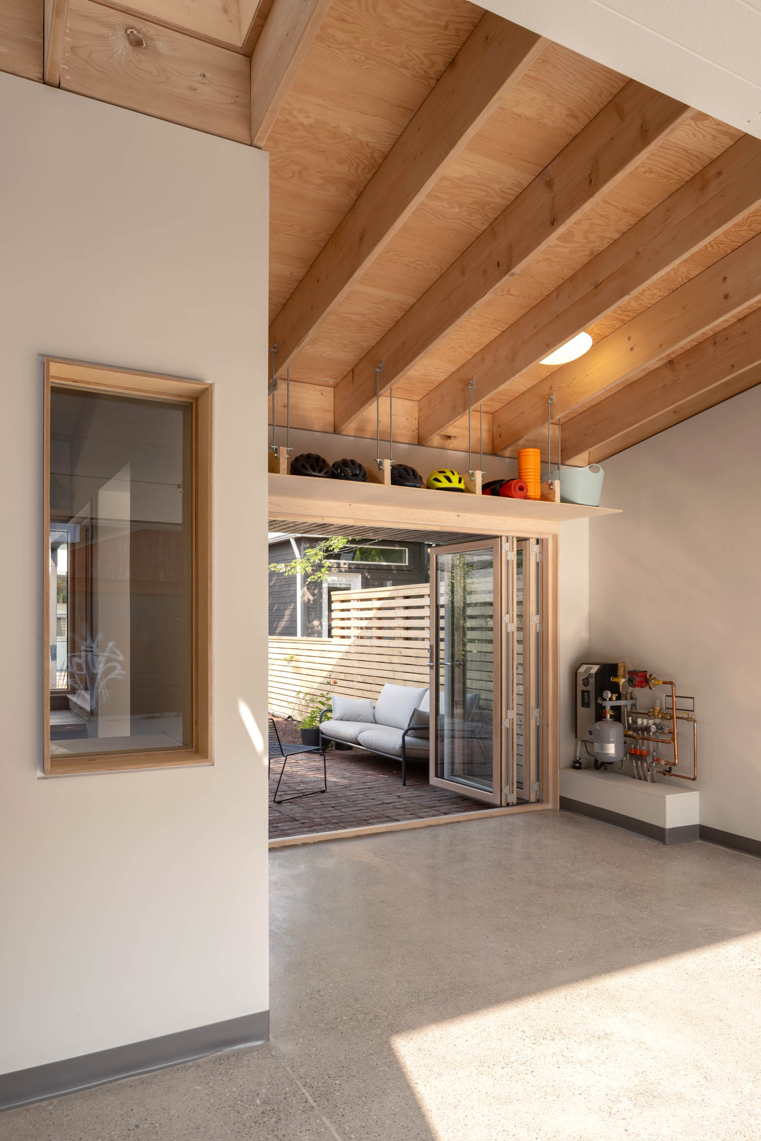
Materials and detailing play a big role in your projects. Could you talk about the material choices for the Laneway Workshop and how they contribute to the durability, functionality, and visual appeal of the structure?
We wanted to present a sort of tough industrial aesthetic to the laneway side, which would also hold up well in our environment. On the garden side, we wanted something more natural, more hand-made, in the charred wood and hand-made pavers. The interior is meant to be a bit of a surprise with all of the exposed wood. This is also functional as it gives a lot of surfaces to hang things from. Like a lot of architects working at this scale, we fuss a lot over details. Maybe it’s excessive. For the floor, we did a deep dive into grinding the concrete with a certain aggregate exposure, and then applying in stages polishing and salt-resistant sealer that seemed to take ages to source properly. A neighbour walked in late in construction and said “you’re going to drive on this?!”
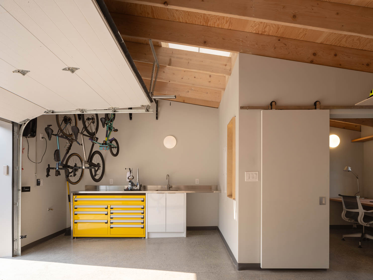
The project needed to accommodate both work and leisure activities, from hybrid work arrangements to birthday parties and outdoor seating. How did you design the space to be flexible and adaptable to these various functions, especially in a limited urban footprint?
It was important to have large areas of the laneway and garden-facing walls open-up completely. So we got a custom-sized insulated rollup garage door, and a folding glass door. The clients held a big birthday party recently while still warm weather and the garden and laneway got linked with the workshop acting as a kind of inviting pavilion. The nice thing about laneways is that they really aren’t that busy with vehicular traffic, so kids can play in them. In the winter, I expect it to be more of a refuge from the main house, with the garden a kind-of liminal space that at least makes you feel like you are not exactly working from home, while still having the same conveniences. The limited footprint was actually a nice challenge. I think many architects prefer to operate in small spaces. Design decisions on relationships between elements seem more strongly held and certain than if you have more space to work with.
Given Toronto’s evolving laneway house trend, what are your thoughts on how small-scale projects like the Laneway Workshop can influence the future of urban design, especially in terms of creating multi-functional, adaptable spaces for modern living?
I think these types of small non-residential uses are an extension of trend going back a few decades now away from separated uses in our zoning by-laws. In Toronto, planning orthodoxy for the past maybe 15-20 years has been to talk up “complete communities”, but that really only seems to apply to mixed office-residential-retail uses in big development sites, often around transit. We really need to extend that thinking to the vast areas of our cities that are zoned exclusively residential. This project is a small step in demonstrating the power of small mixed use, we hope.


