How BEDA Turns Constraints into Creativity: A Look at Slat House
Beda has gained recognition for its thoughtful approach to small-space design, transforming compact layouts into functional, inviting environments. Founded by a designer with experience in New York City, BEDA’s projects reflect a balance of practical needs and creative potential, a perspective shaped by years of work across both residential and large-scale developments.
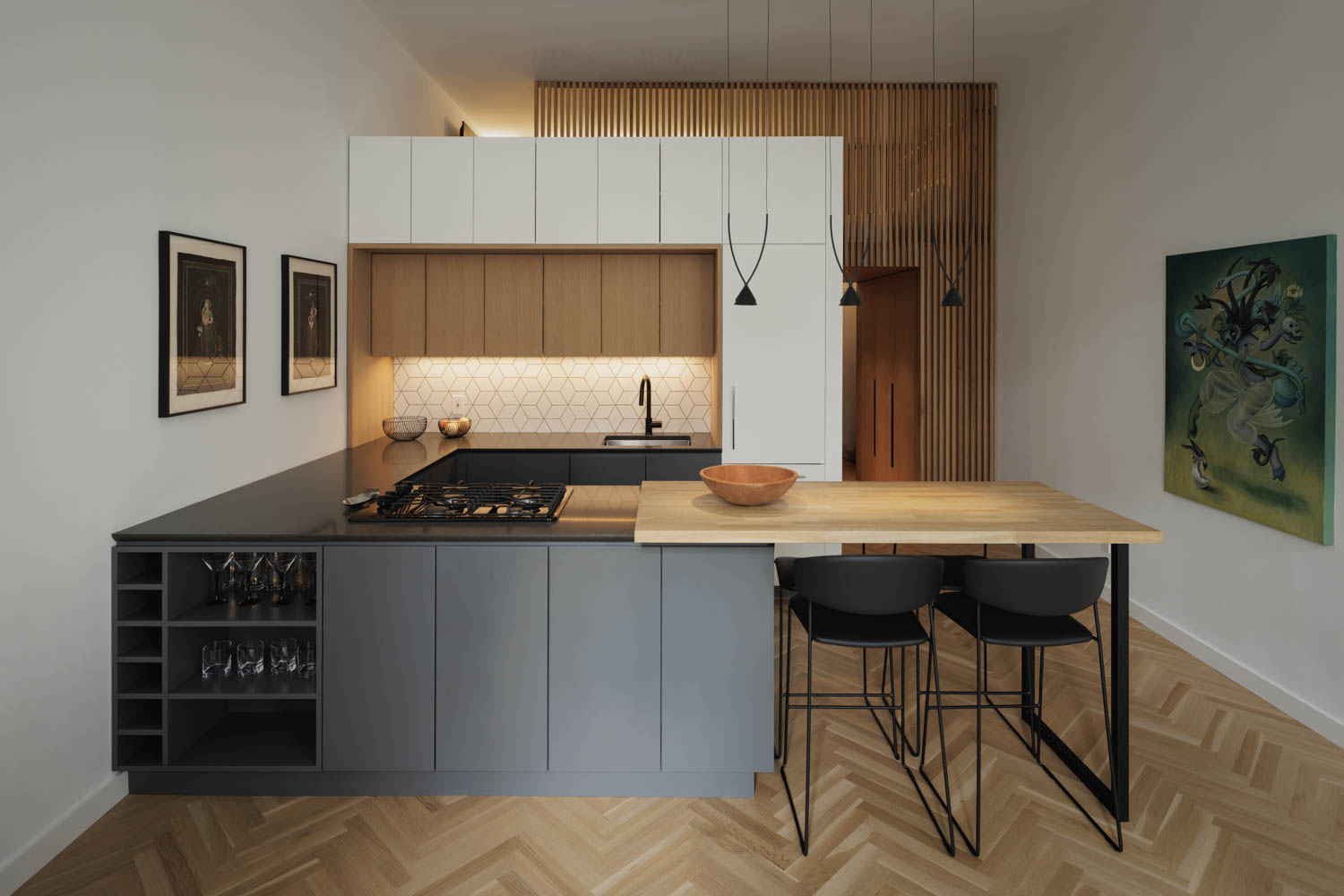
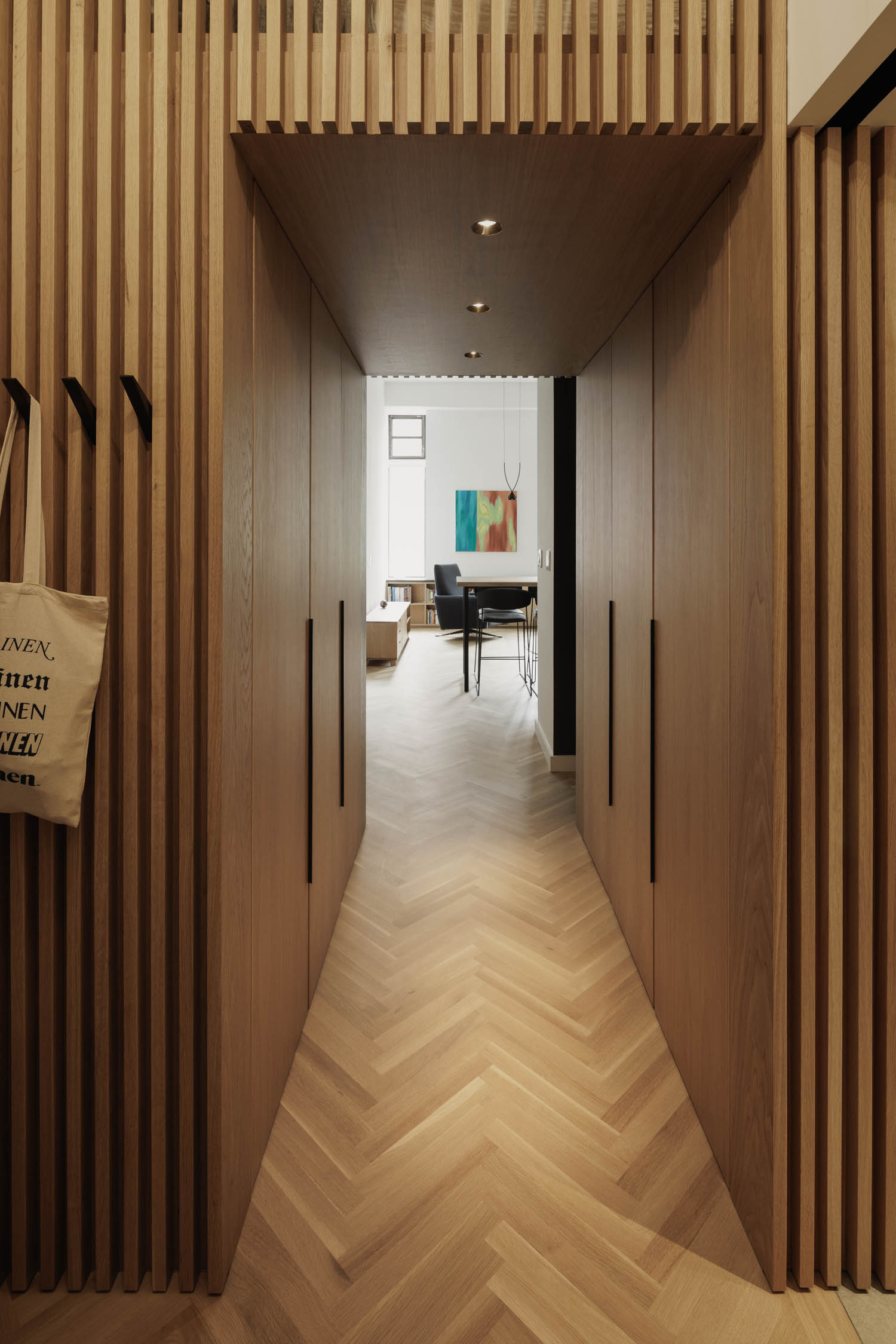
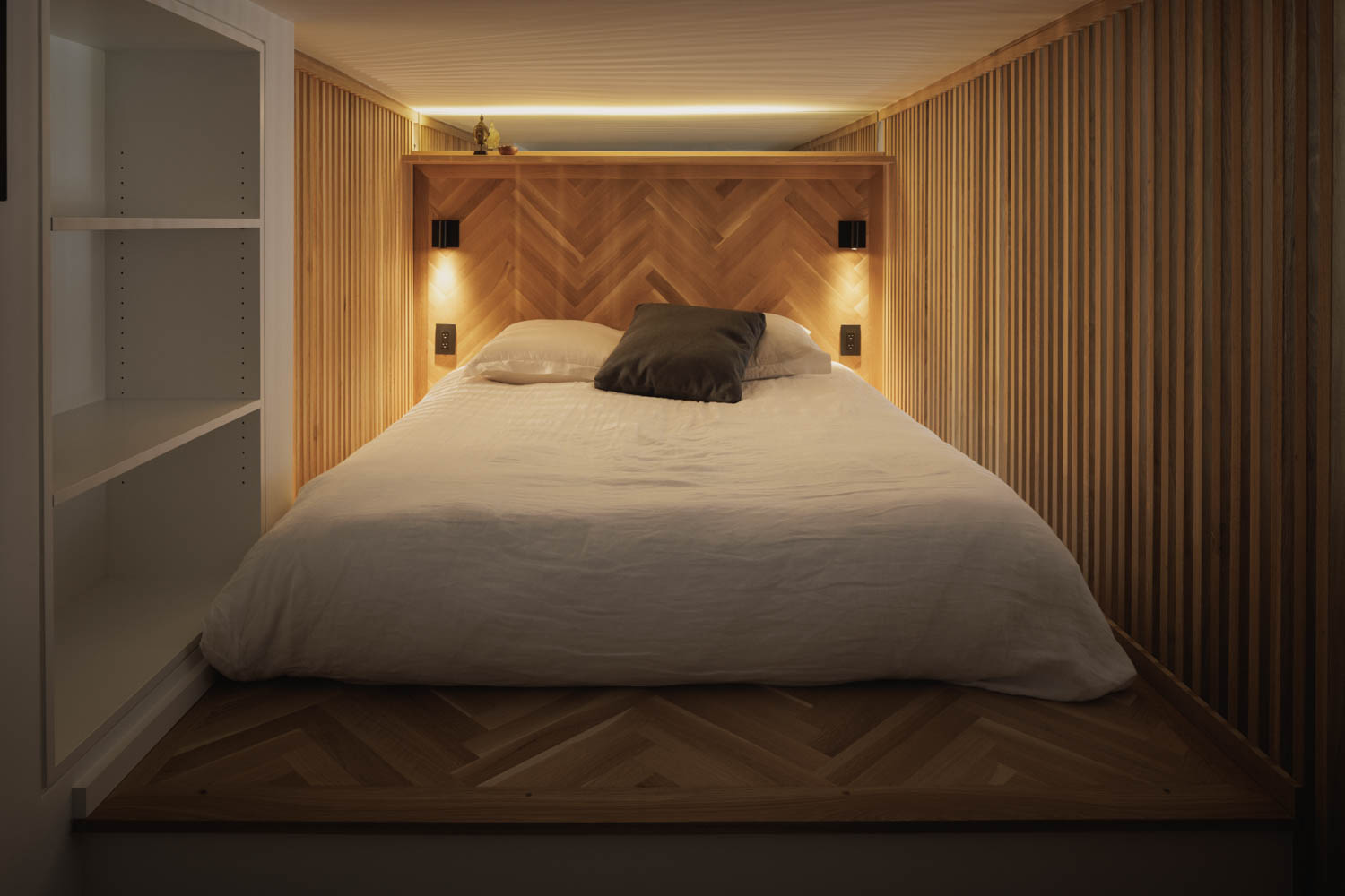
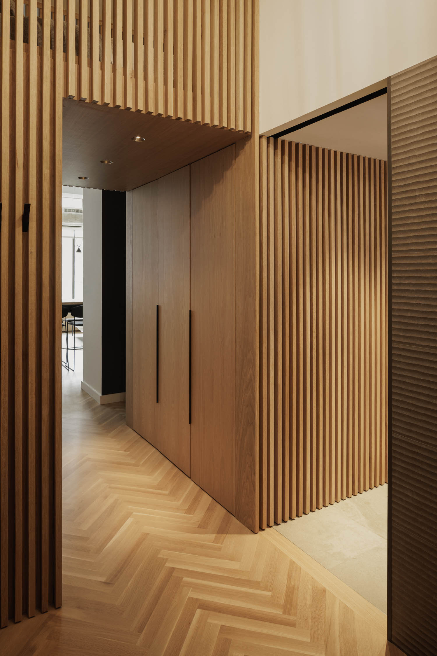
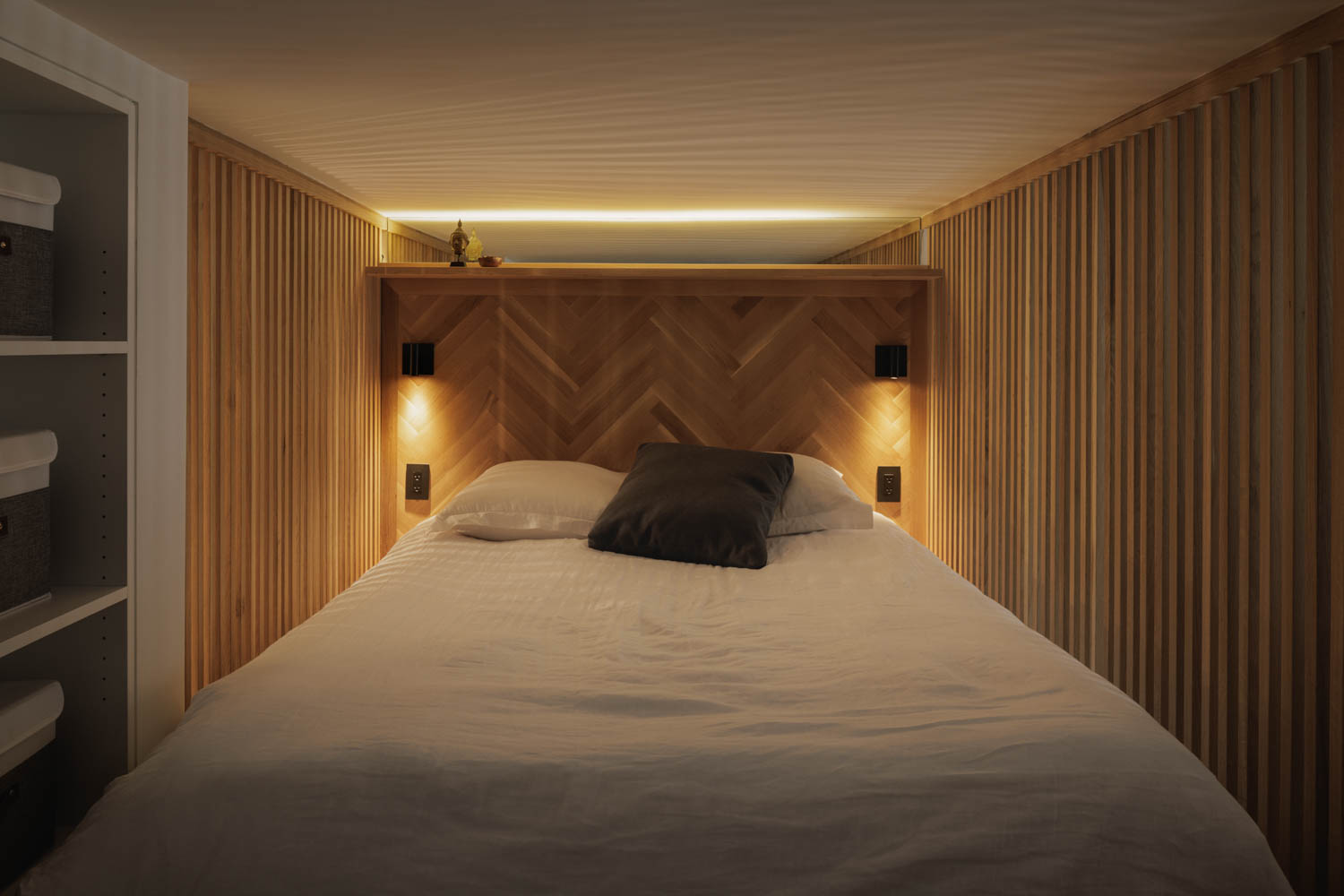
This philosophy comes to life in the firm’s Slat House project, where a 500-square-foot apartment was reimagined to create distinct spaces and a sense of openness. In this article, we’ll look at BEDA’s origins, explore the design vision for Slat House, and examine the thoughtful details that make small-space living both efficient and enjoyable.
Article responses by Brad Engelsman of BEDA
Photography by Michael Grimm, Published with bowerbird
See other apartment designs from tinyhousezine.com
Beda has gained recognition for creating impactful, well-thought-out designs in compact spaces. Could you share a bit about the origins of your practice and your design philosophy, particularly when it comes to small projects like Slat House?
I had been working in New York City for a number of years prior to starting BEDA. My previous experience allowed me to work on a variety of projects from small retail and residential projects to large scale multi-use developments. When I decided to start BEDA, I did so in parallel to beginning a career in academia teaching and coordinating design studios. At BEDA we believe there is conceptual design potential and value in every project. And, we feel, partly stemming from our academic side, that each project, no matter the size, offers an unique opportunity to explore interesting ideas and design directions.
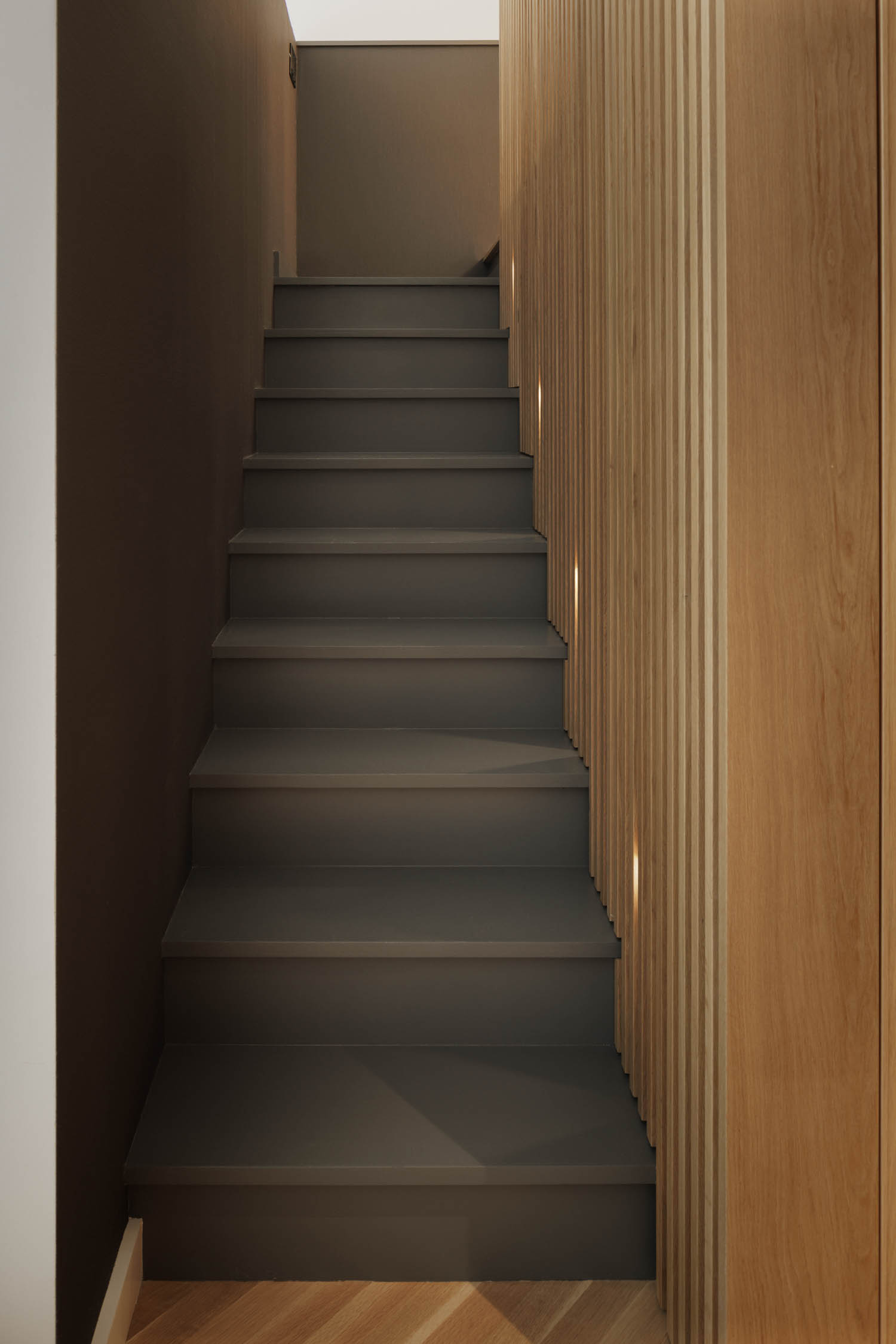
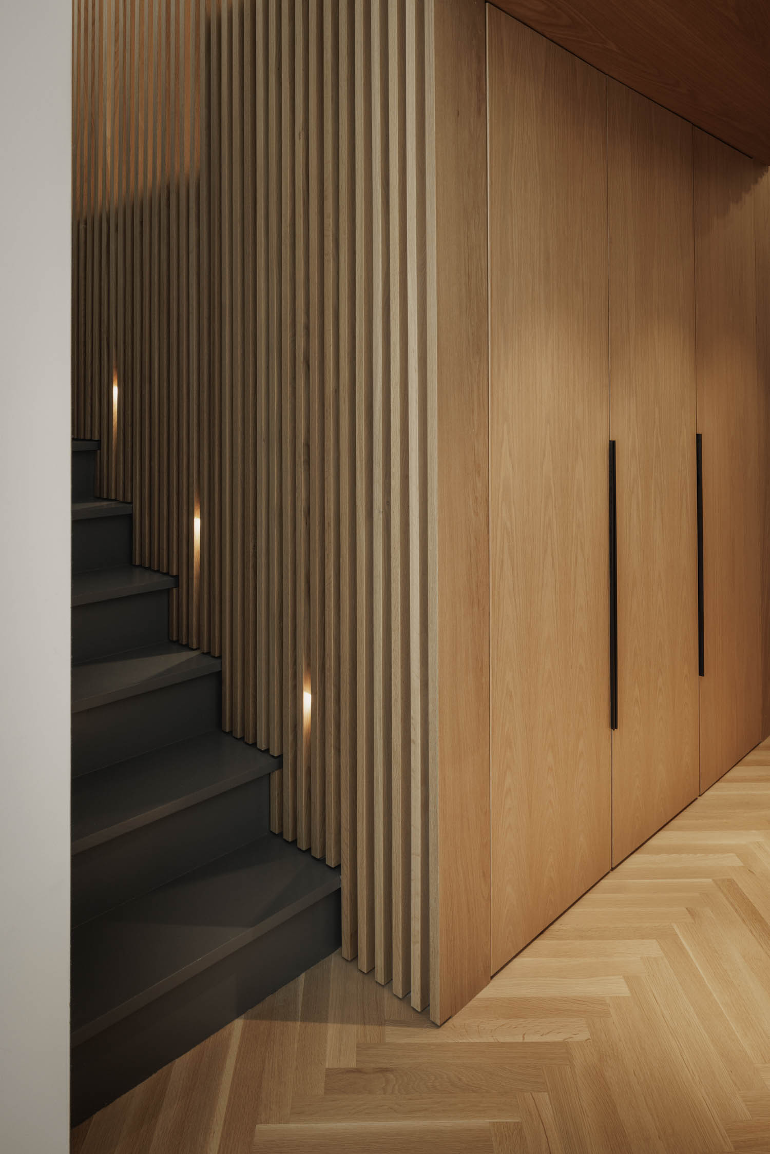
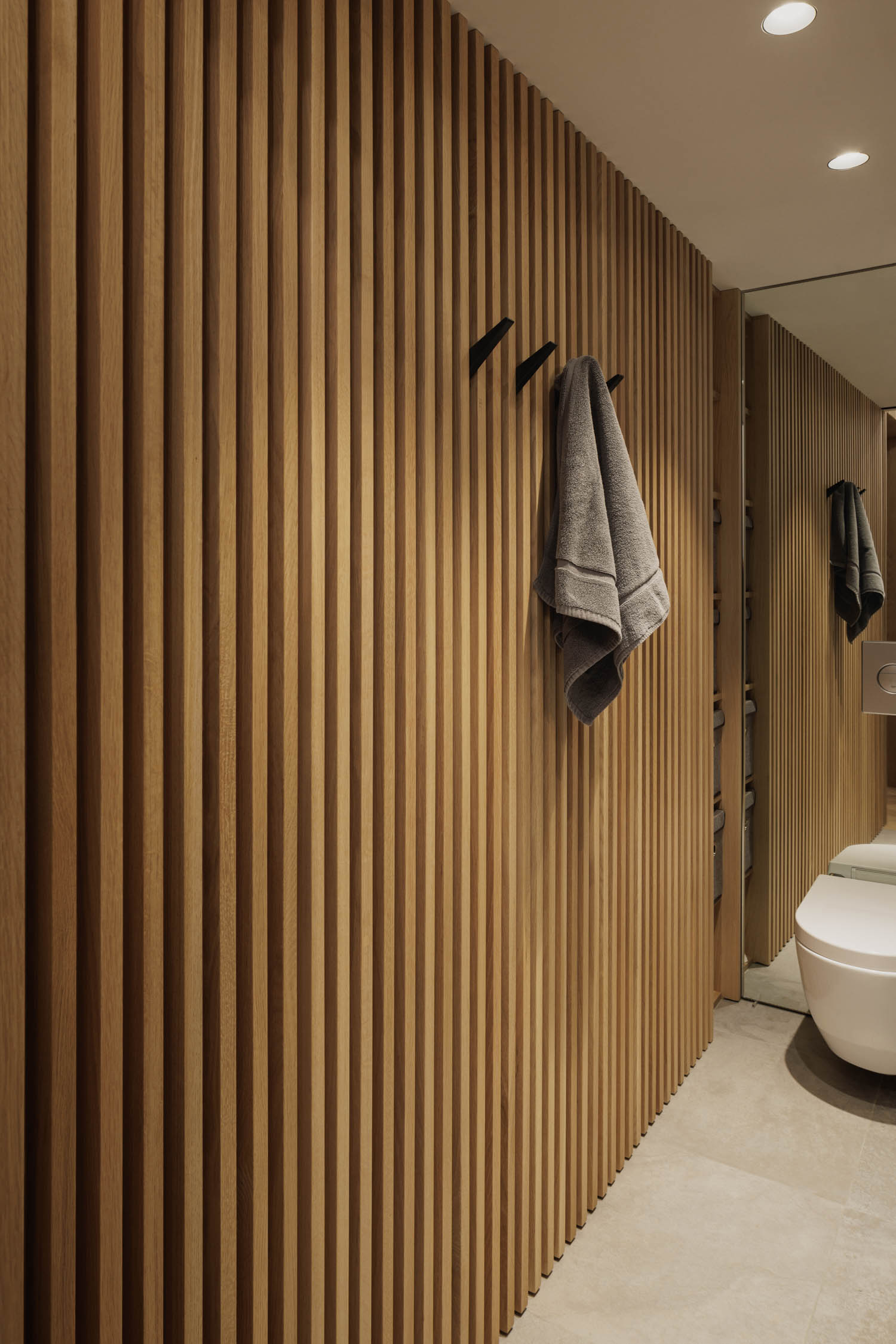
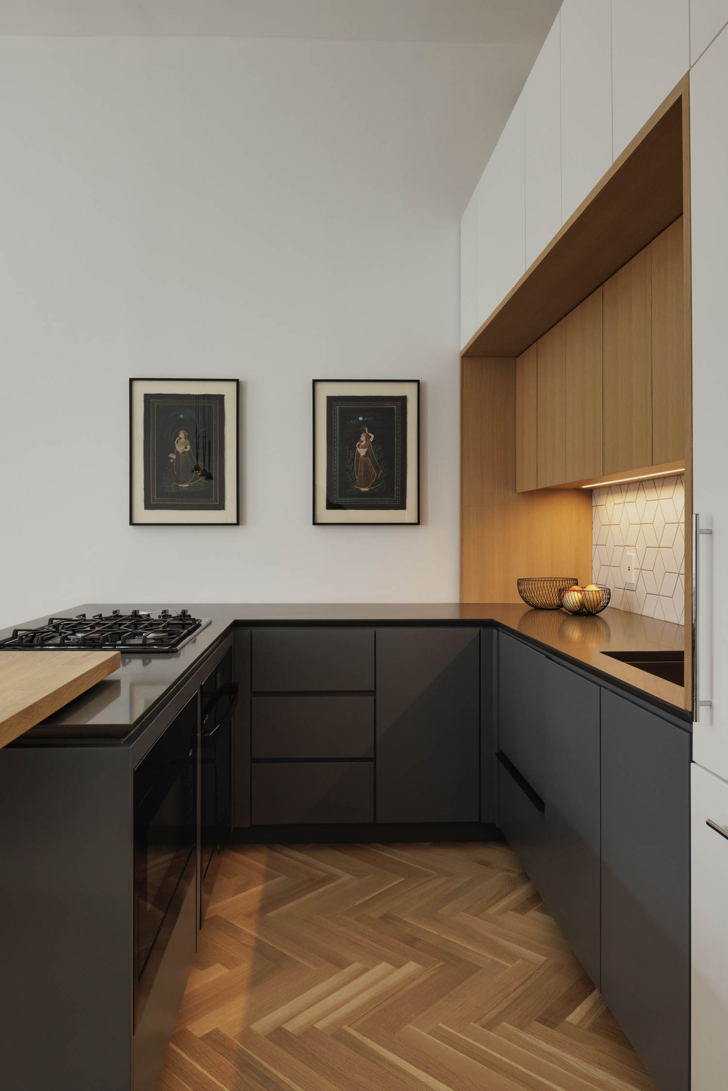
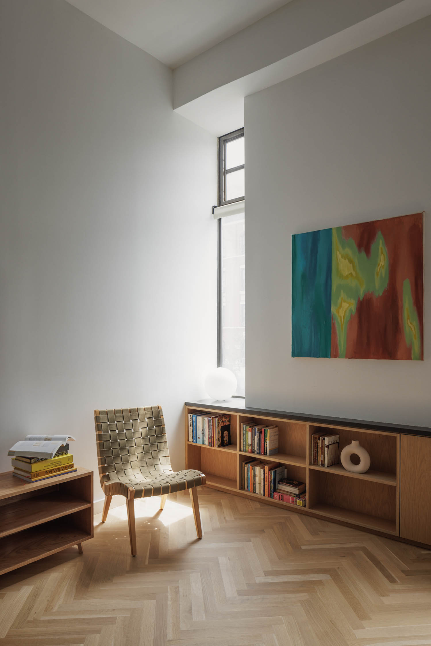
Slat House is a stunning example of how creative design can transform small spaces. Could you tell us about the initial vision behind the project and how the client’s desire to rethink their 500-square-foot apartment shaped your approach?
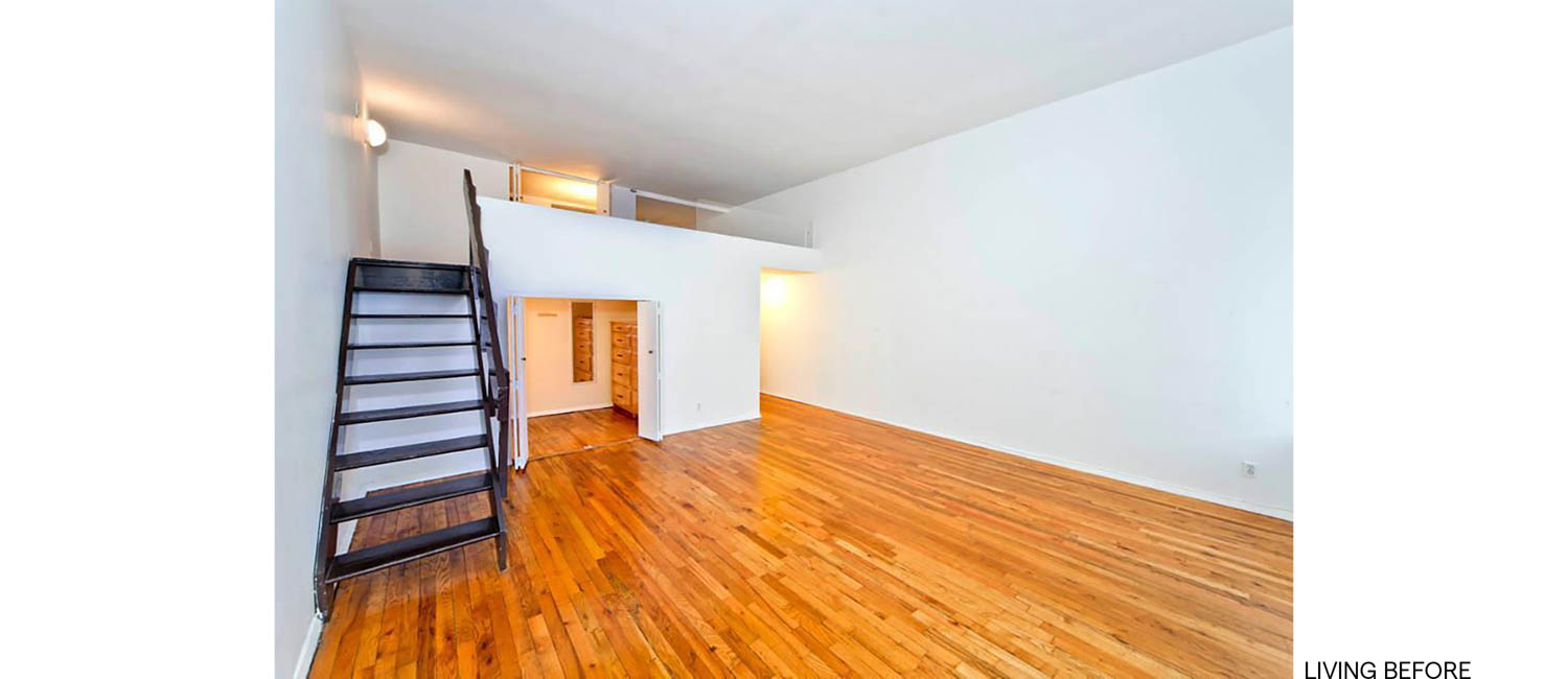
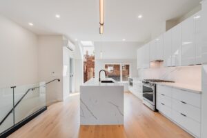
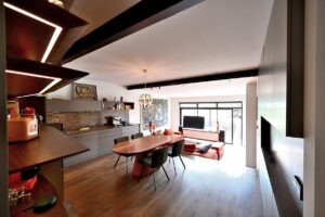
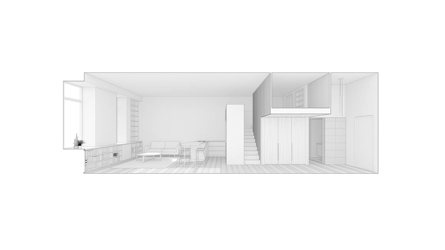
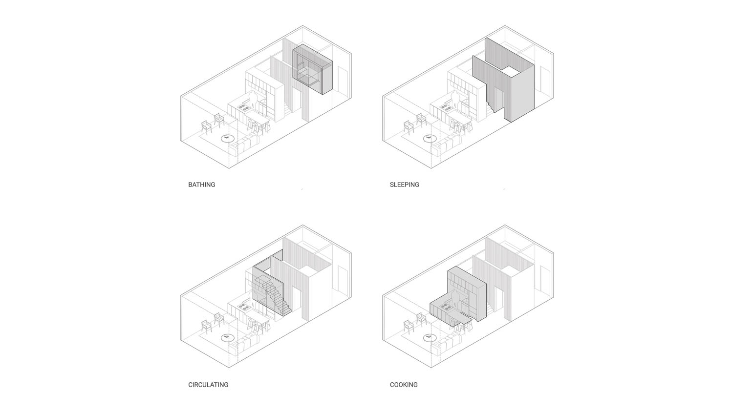
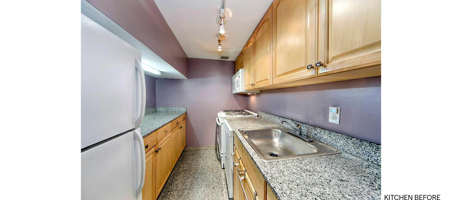
The initial brief, and main goal, for the project was very straight forward – move the kitchen out from in its own room and open it up to the living room. This was easier said than done. Due to the small size of the apartment, navigating that relocation impacted every other space. The design came down to a matter of inches both in the layout, and in how spaces stacked on top of each other. Once we identified the spaces/programs required for the project, we settled on the direction of treating each of those spaces as a unique volume with a different material pallete.
The use of stacked volumes and material palettes to define distinct spaces in such a compact layout is remarkable. How did you approach the challenge of balancing open and intimate spaces while maintaining functionality and flow in the apartment?
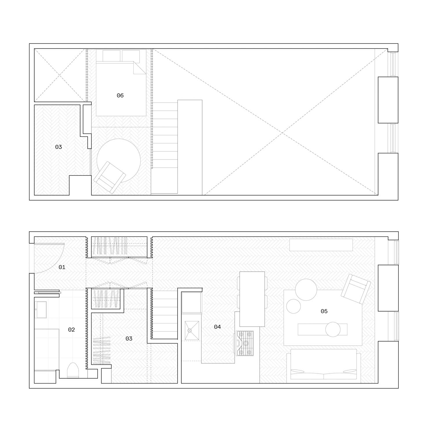
The balance of open and intimate spaces within the apartment really came down to how much space was available. In the interest of efficiency, we quickly decided that the spaces would be moved to the west side of the apartment to allow for a direct connection from the entry to the kitchen and living space. Once we landed on the kitchen and living areas being the open gathering spaces, and that the bathroom would be located toward the entry, we were able to fill in the “negative” spaces with storage. Once the lower level was determined, we knew that we’d be able to stack the sleeping area above. Enclosing this area with the open slats was the final piece of the puzzle which allowed light to be shared between spaces while still providing privacy.
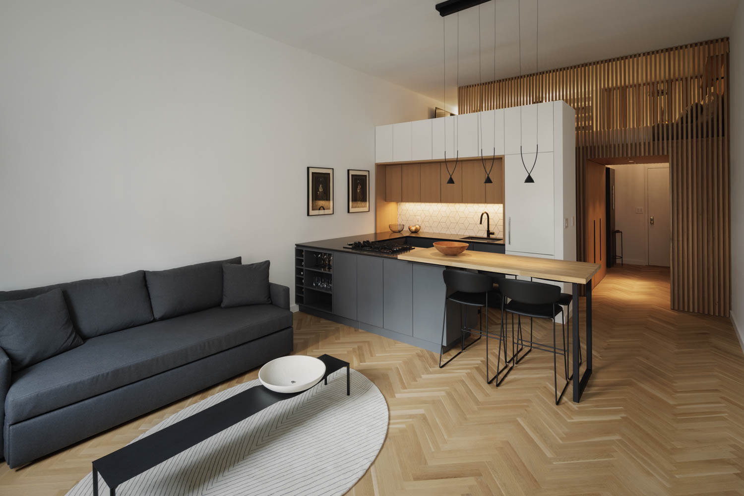

The material palette of stone, tile, and white oak plays a key role in differentiating areas of the apartment. What inspired the choice of materials, and how do they contribute to the overall experience of living in such a compact space?
In terms of the material palette, we studied many variations of finishes before we ended on the final version. The one goal that was always present was that the client was drawn toward materials and finishes with a strong graphic or pattern – whether it be linear striations, hexagons, chevron flooring, etc. The layout allowed us to provide material volumes which you start to move through and between. So, the stair cuts between the wood slats and the kitchen, or the bathroom primarily sits in the grey tile volume and you enter between that and the wood slat volume. Once we were able to distinguish between the various volumes, we could then begin to assign materiality to each.

The lofted sleeping area is a clever solution in small space living. How did you navigate the ceiling height and volume allocations between passive loft space and the more active living areas, and what were the key design considerations?
The ceiling heights were a surgical navigation of inches that were adjusted all the way through construction. For example, once rough framing was complete the client moved through the space and decided if it was comfortable or if we needed to move floors/stairs/landings up or down. It became a game of walking the line and assigning priority to the height of different spaces. Do you want more head height on this landing, or in the storage below? In the end, while some spaces won out, there weren’t any that completely dominated that game. This resulted in a comfortable experience in all the spaces, especially for the client.
