Thoughtful Micro Sanctuary Apartment Design in St Kilda by Tsai Design
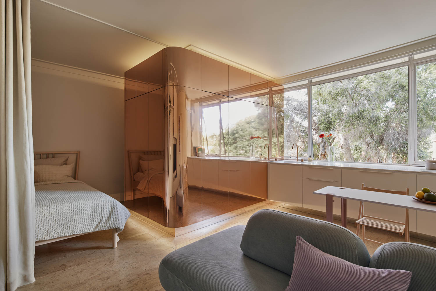
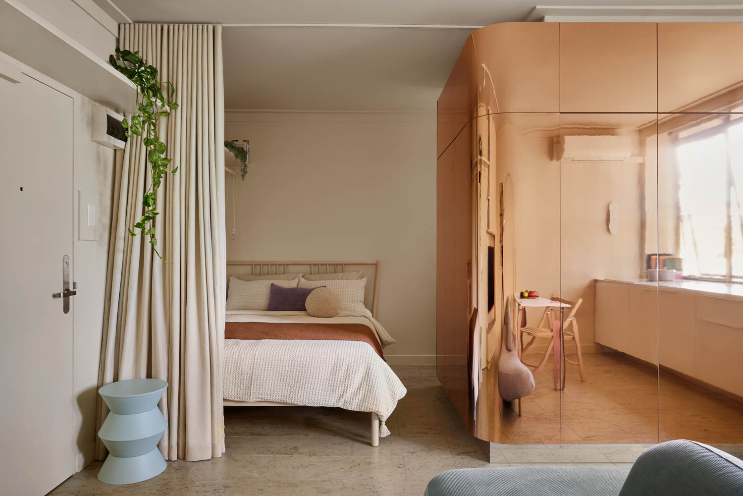
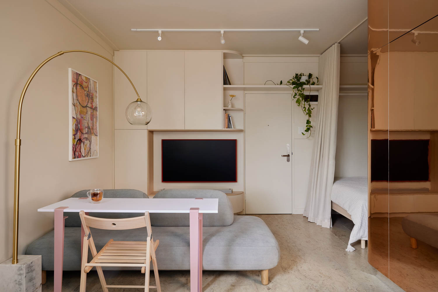
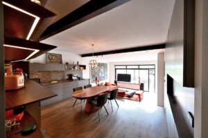
Located in the lively suburb of St Kilda, Melbourne, the St Kilda Micro Sanctuary by Tsai Design showcases how thoughtful design can make the most of a compact 25 square meter space. St Kilda, with its mix of beachside charm and eclectic architecture, is home to this 1970s walk-up apartment. The project skillfully balances the needs of a temporary home for the clients with the functionality required for an Airbnb rental. With smart use of space, including multifunctional furniture and a unique copper-clad bathroom pod, the apartment provides both comfort and practicality in a small footprint.
Published with bowerbird, Photographed by Tess Kelly
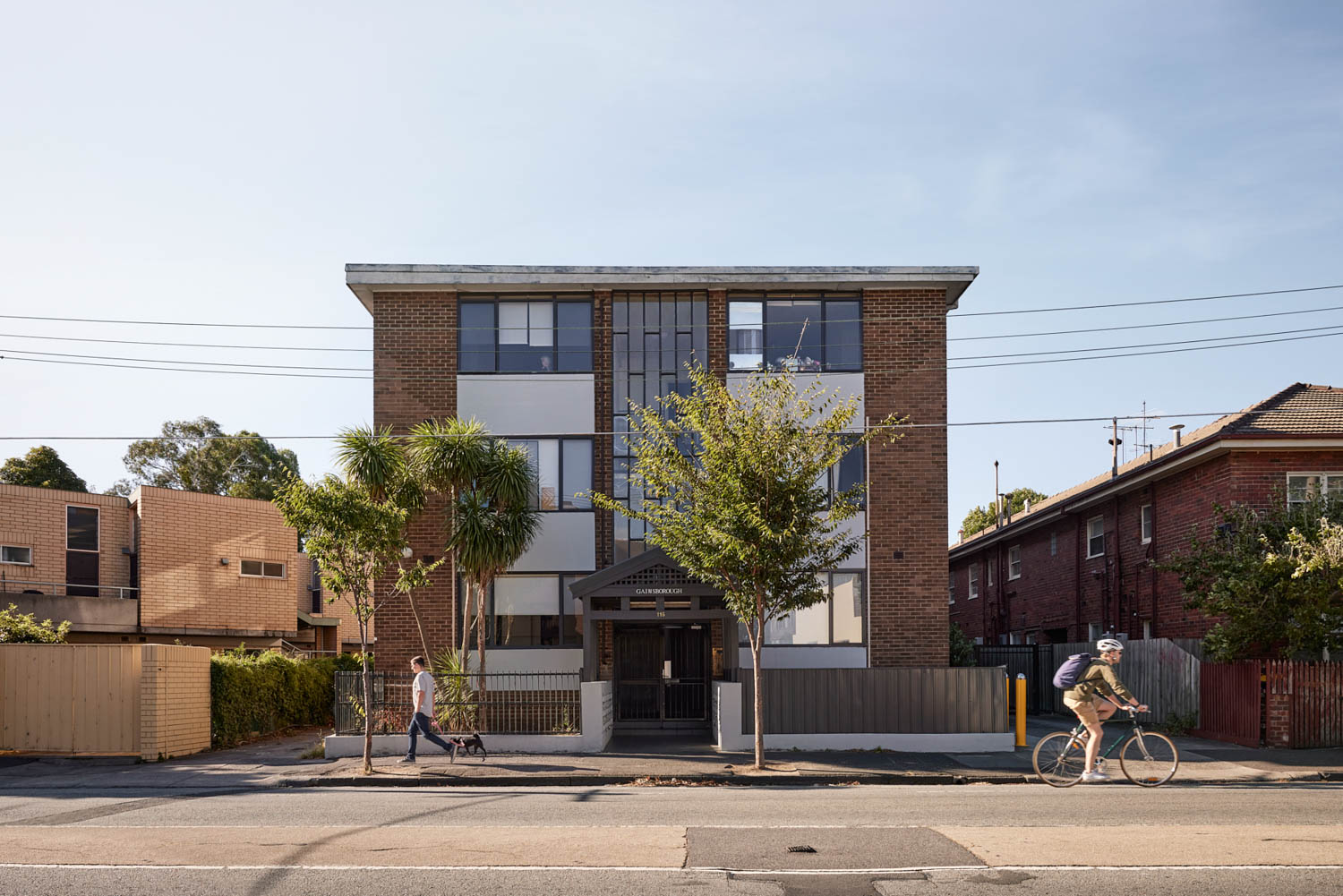
Can you describe a bit about the St Kilda context and the character of the original building?
St. Kilda is one of the popular suburbs that’s close to the beach. With plenty of café, pub and eateries around. There’s a eclectic mix of building types, including this apartment buildng, which looks to be a 70s walk up apartment.
What inspired the concept for St Kilda Micro Sanctuary, and how did you approach designing a space that serves both as a temporary home for the clients and as a rental property?
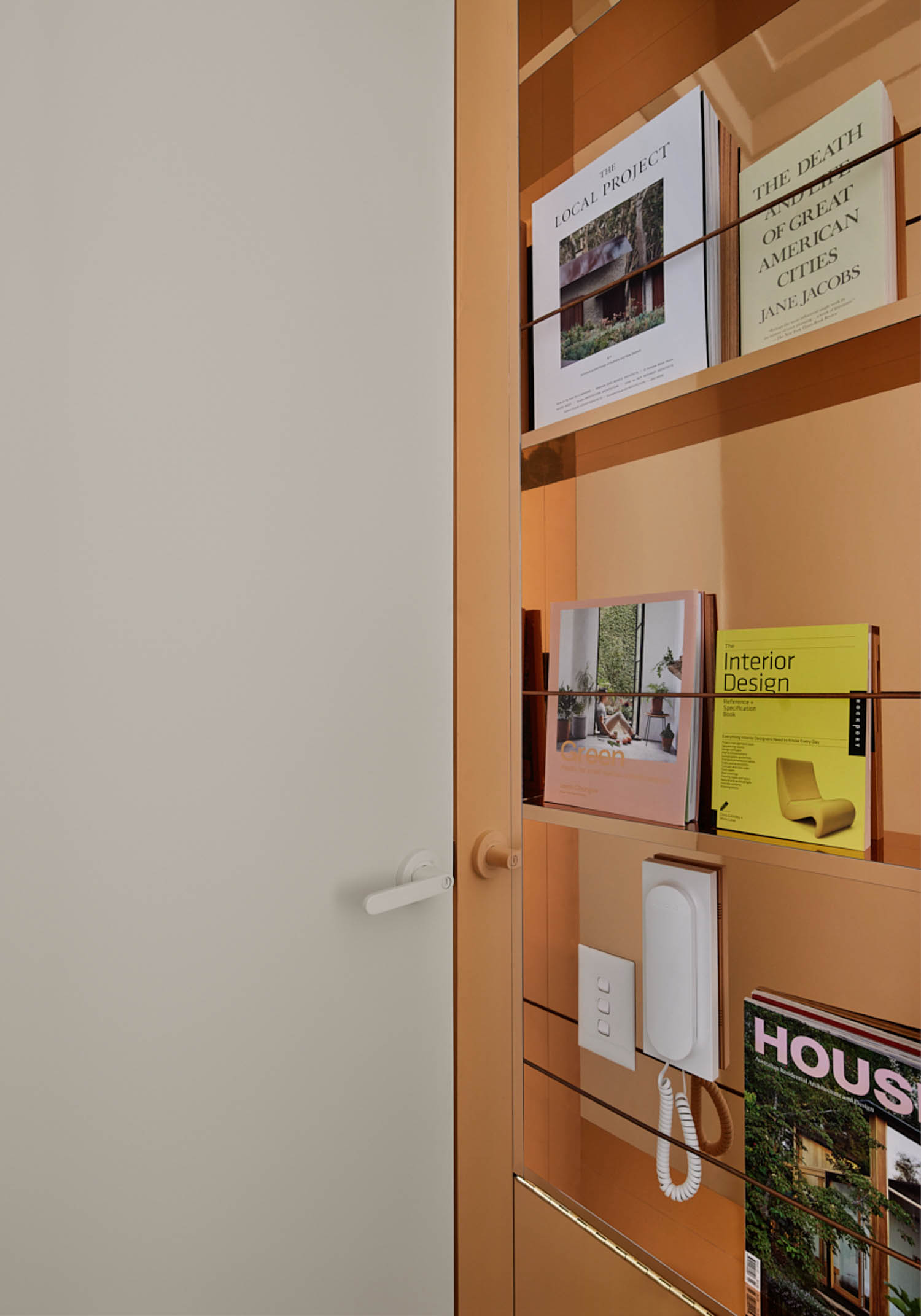
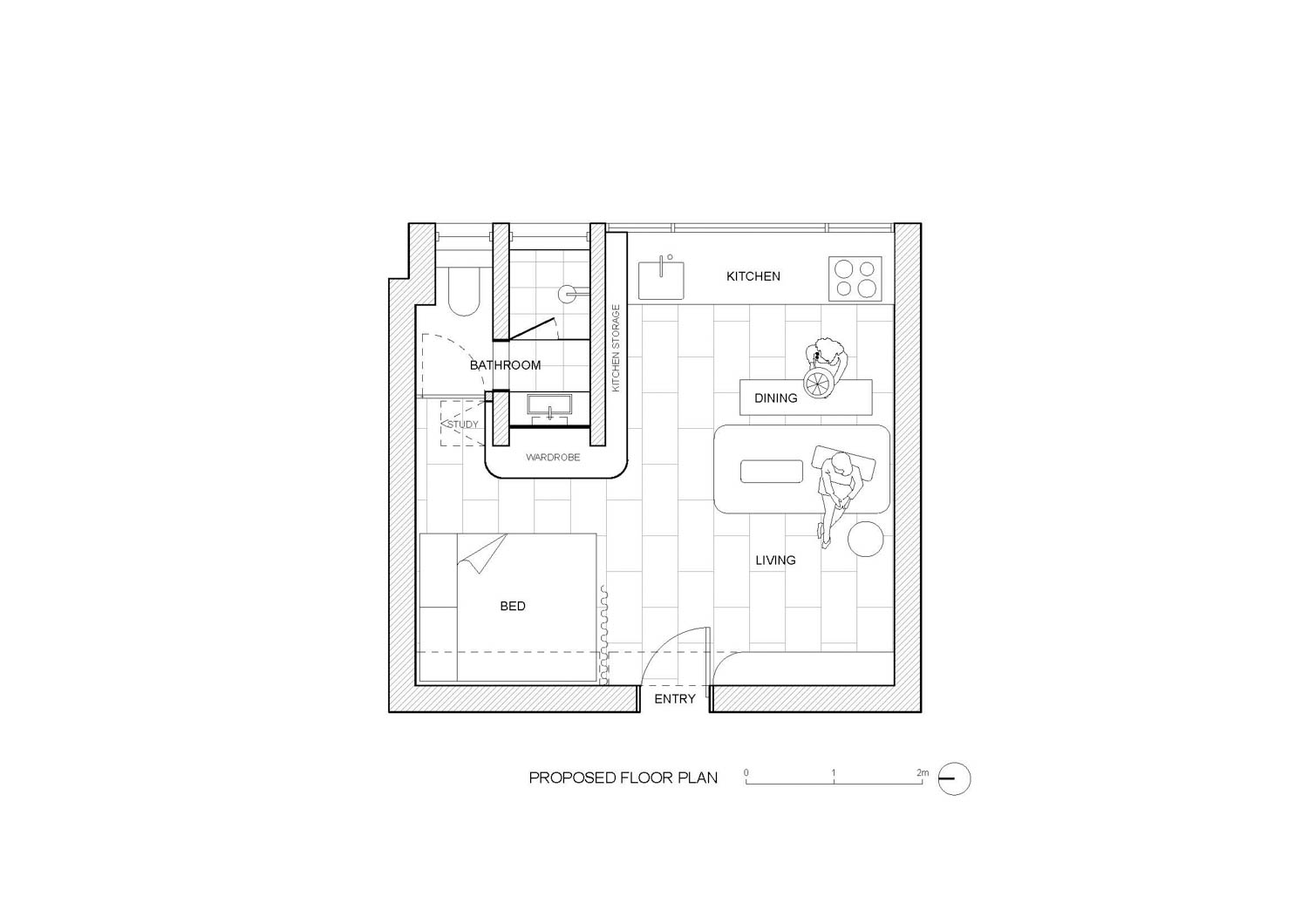
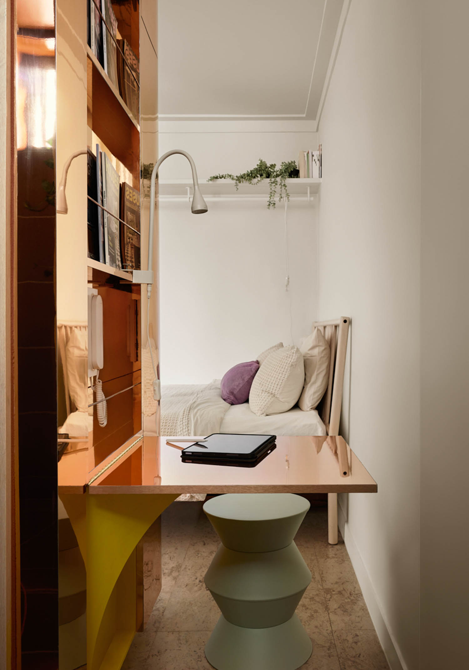
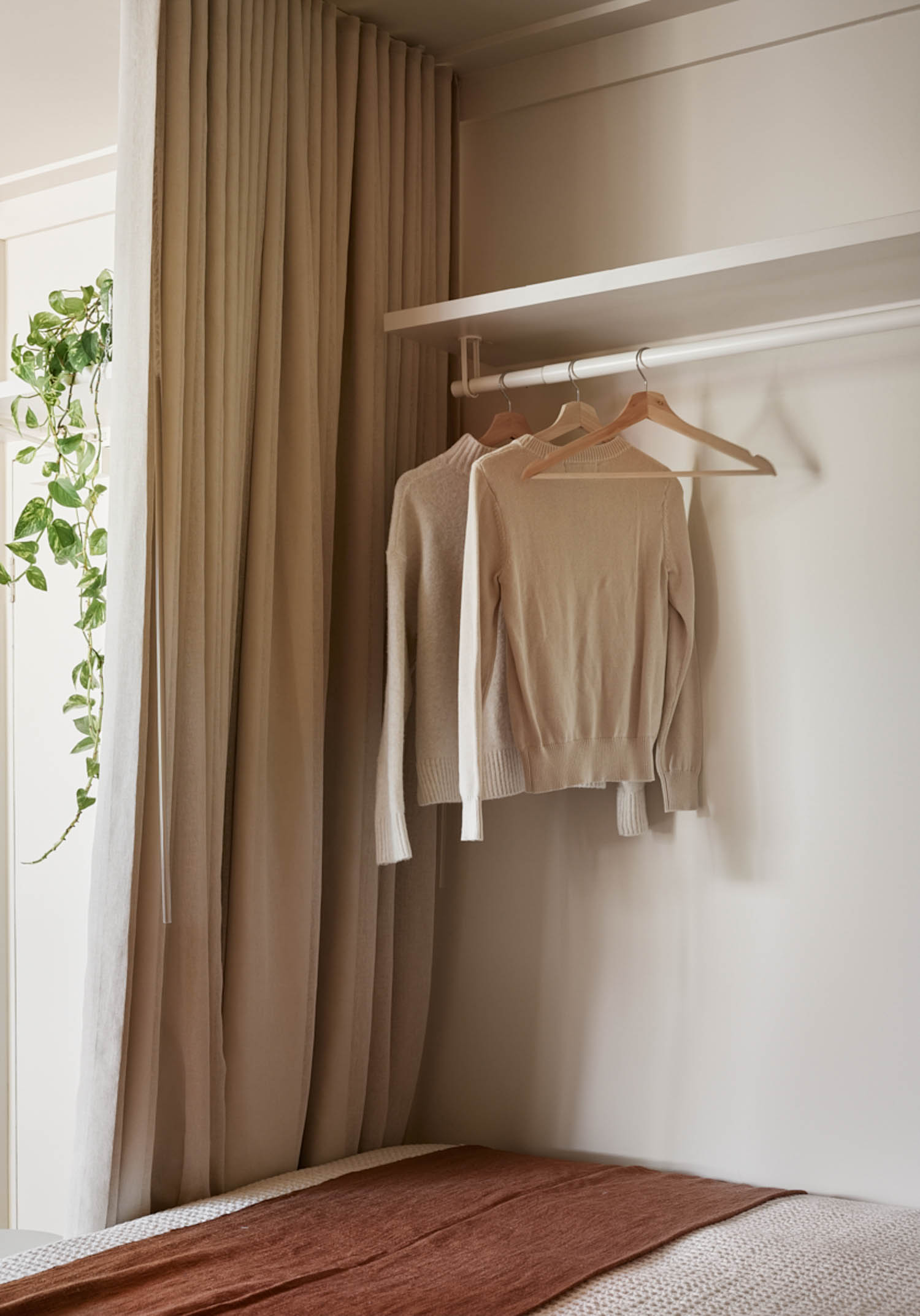
We typically design forever homes for our clients, so we did have to juggle to get the balance right for this unit, we started with a heavier focus on pleasing the Airbnb audience, including the feature copper joinery to create a easy piece that makes this a unique place of accommodation, we had also previously proposed a completely different configuration, with the bed sharing the living space next to the window, as we see the most important aspect of an Airbnb is around the bedroom. However, the client’s lifestyle is completely different, as they work at night and sleep during the day to suit their overseas time. The priority of the bed is to achieve complete darkness. Another part of their life luckily is consistent with Airbnb living, as they prefer to eat out, only very simple cooking at home, so the kitchen setup doesn’t need to be as complete as a typical home. The most contentious design is probably the study nook outside the bathroom door, this is to act as a second workspace, as both clients works from home on laptop, this is for the occasional times when they both need to jump on virtual meetings.
You talk about the illusion of space, and pushing boundaries and extracting the absolute best out of any space. With the compact 25sqm, what smart layout strategies you implemented to maximize functionality and comfort in such a small space?
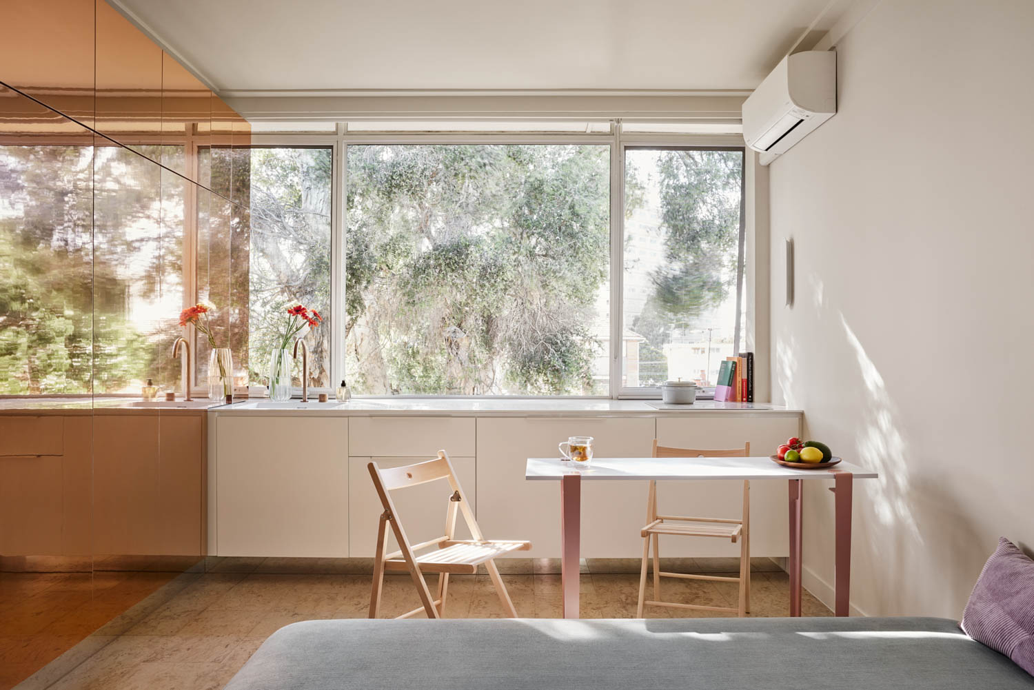
We do learn and adapt with each project, so from our early days we had incorporate more flexible furniture, with sliding out dining tables, murphy beds…etc, with this one we set out to create a space for everything with minimal flexible furniture involved.
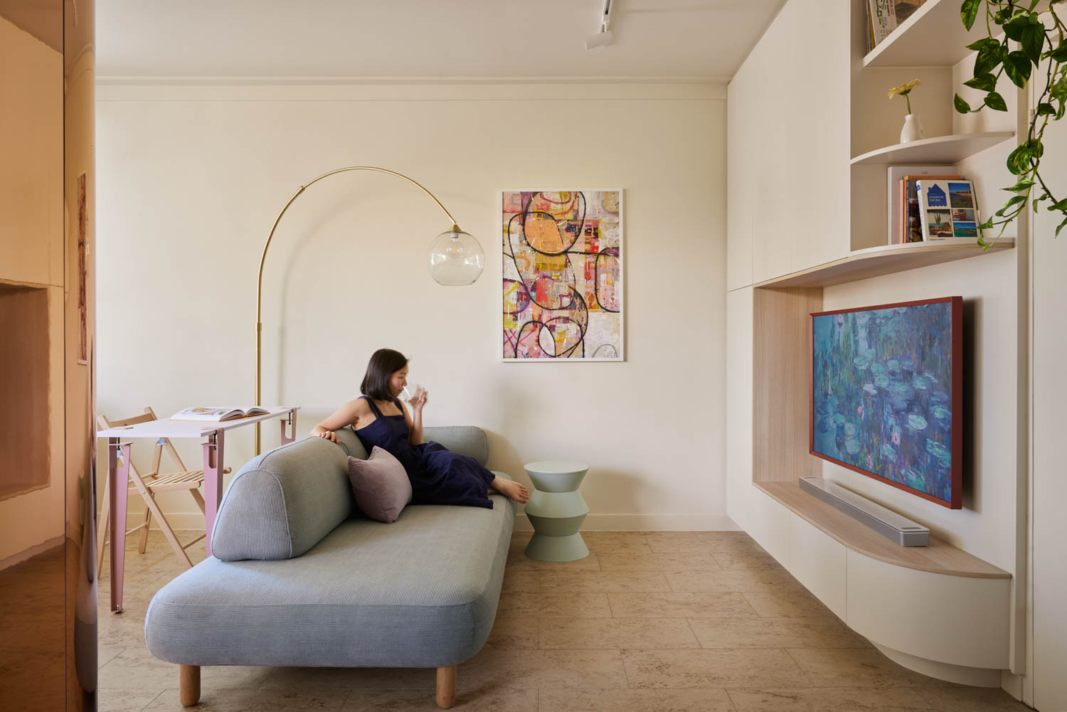
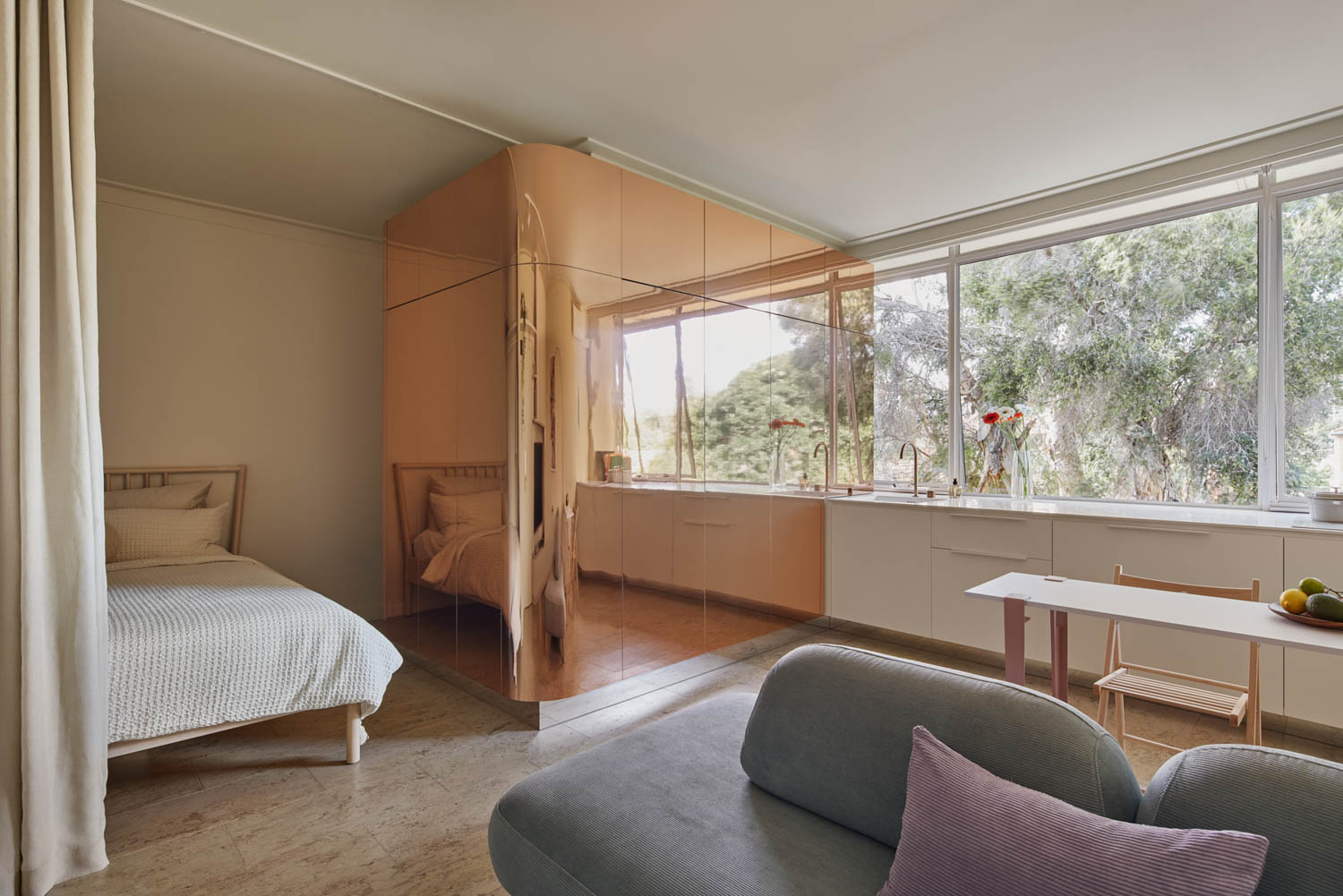
In this instance, it’s the way we share the use of the furniture pieces, so the dining table can double as kitchen island, the lounge seating can be sat on the opposite side to become part of the dining setting.
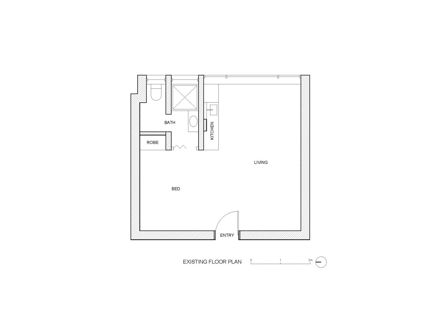
You relocated the bathroom door to improve the apartment’s entry experience. What considerations went into this decision, and how did it impact the overall layout?
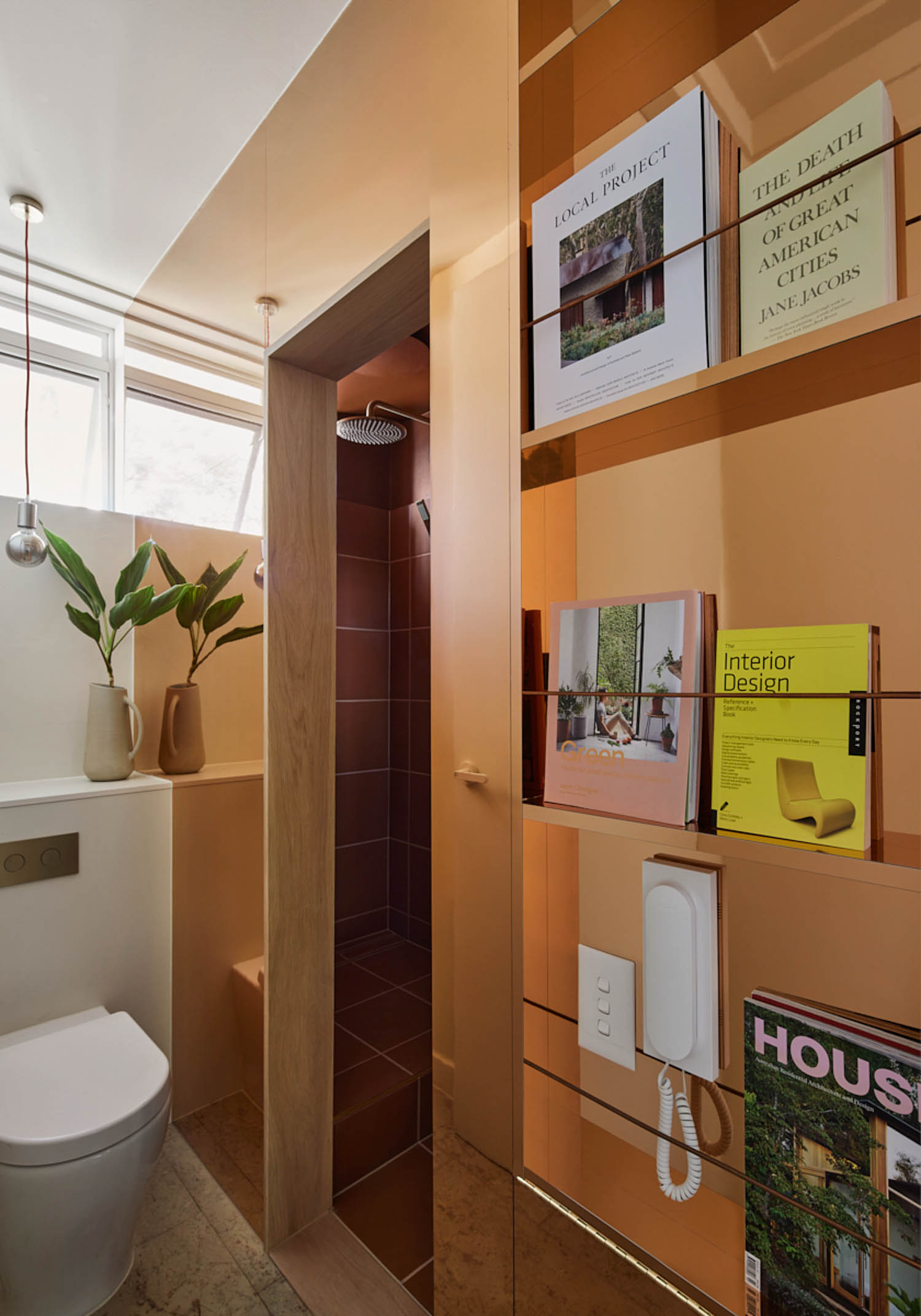
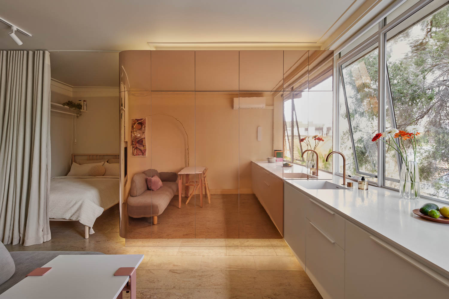
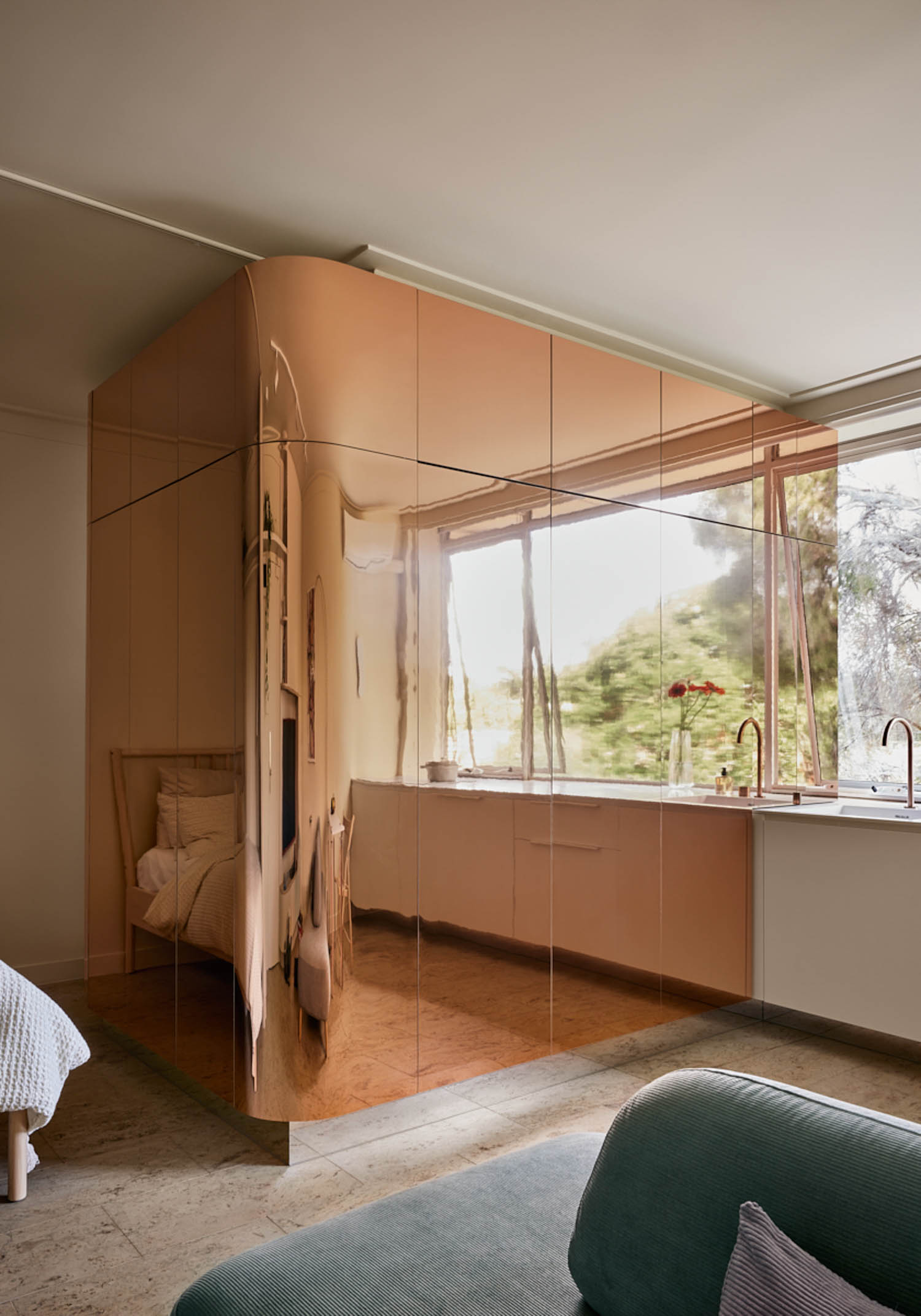
The unit is essentially just a box, so the moment you enter the door, you pretty much see the whole apartment, in the existing condition the bathroom door entry is the first element that pop into your eye sight as it is right in the centre of the room. So dealing with this awkward become one of the main design moves we had to make. We end up relocating the door to its accessed from the end of the room, and “hide” the rest of the bathroom with the copper mirror pod.
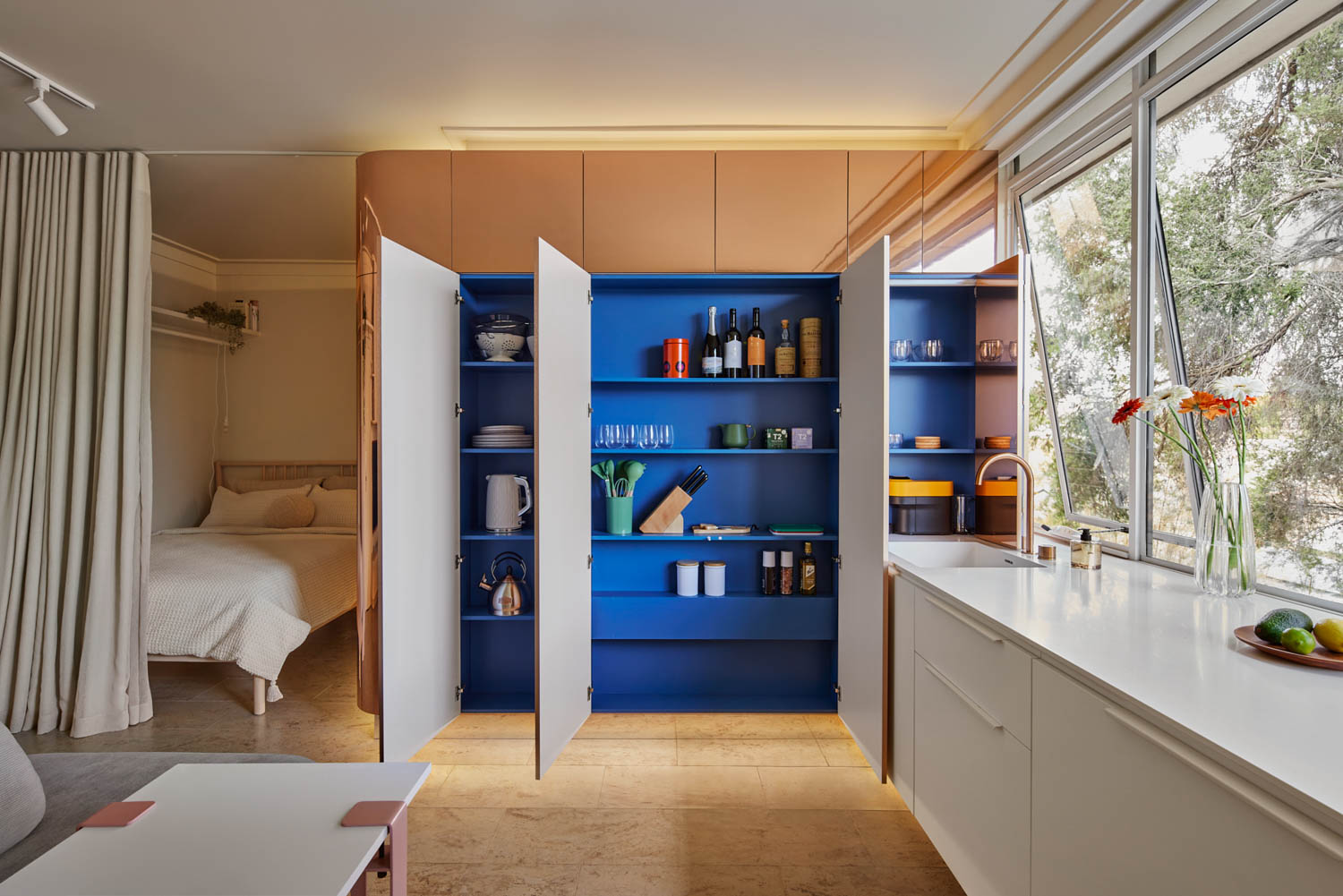
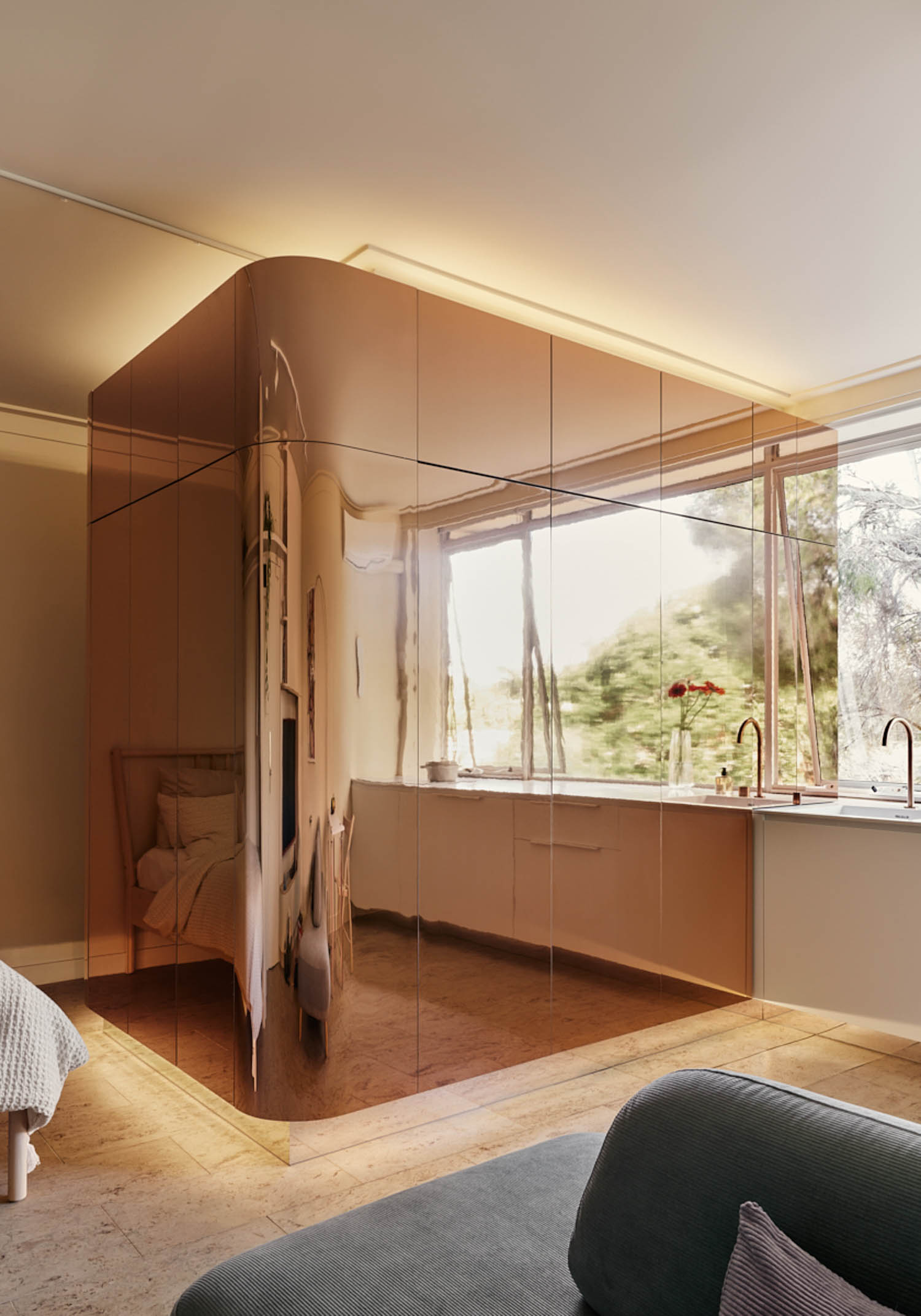
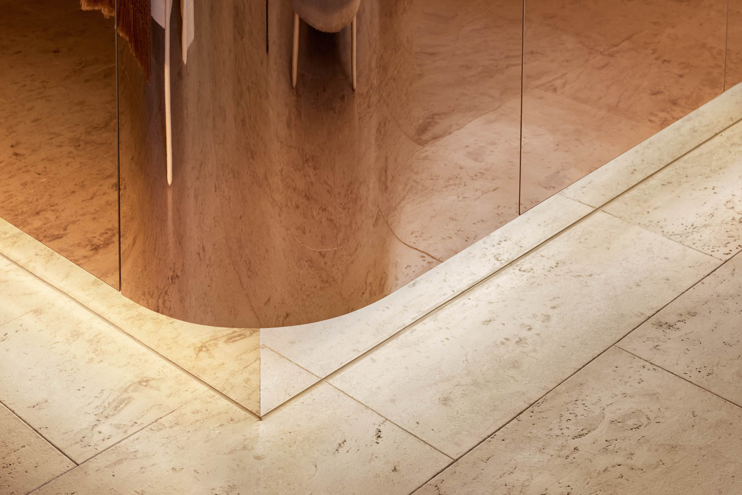
The standout feature is the bathroom pod with curved brass cladding with down and strip lighting. Can you explain the design rationale behind this choice and how it interacts with the rest of the apartment’s aesthetics?
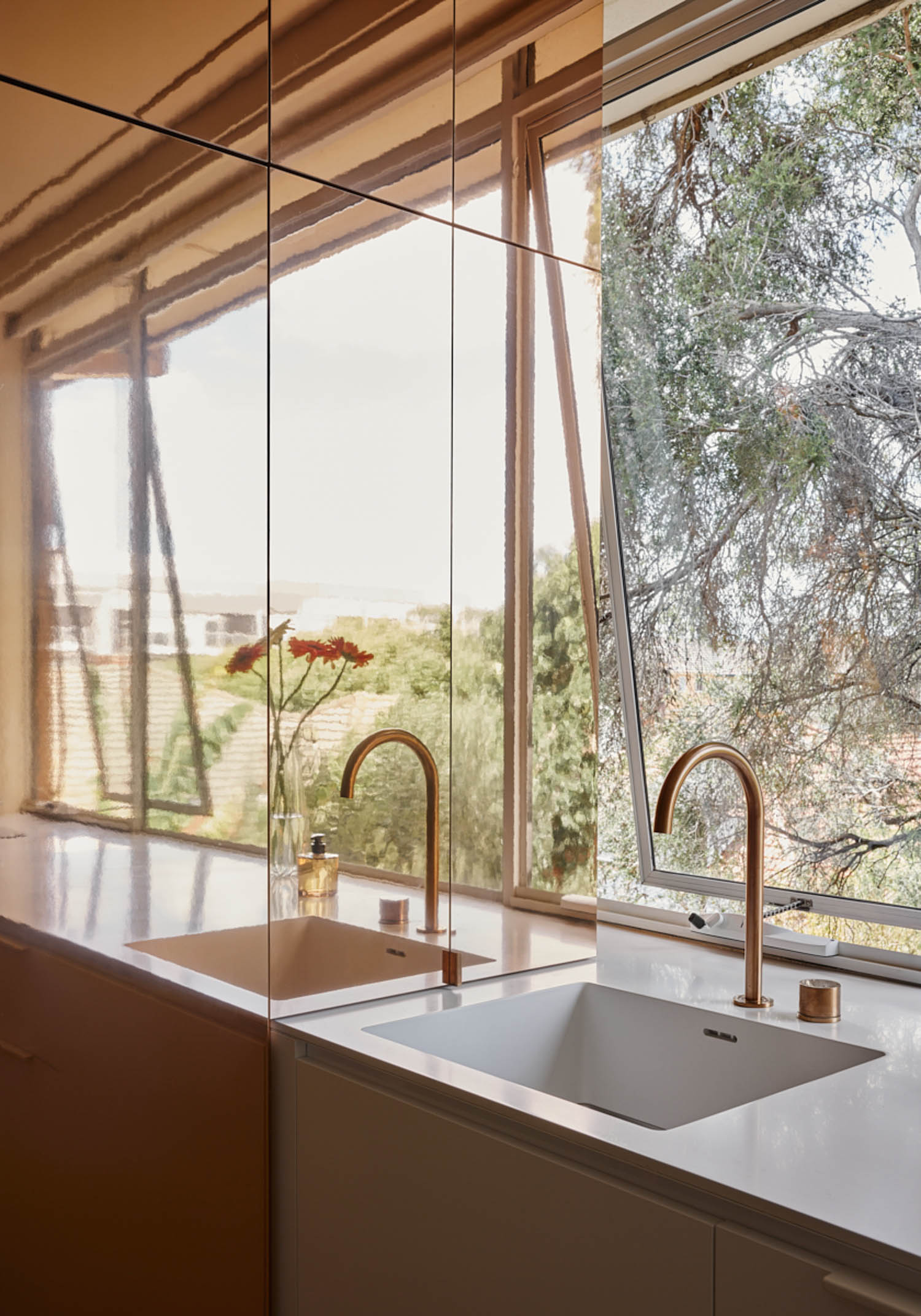
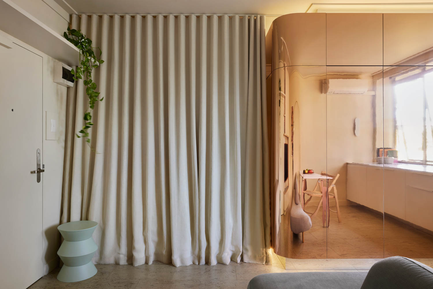
The mirror pod was there at early design to hide the bathroom. It started out as a simple mirror finish pod, I think we use mirrors quite a lot in our apartment designs, as it really helps to open up a small space and hides the volume behind the mirror.
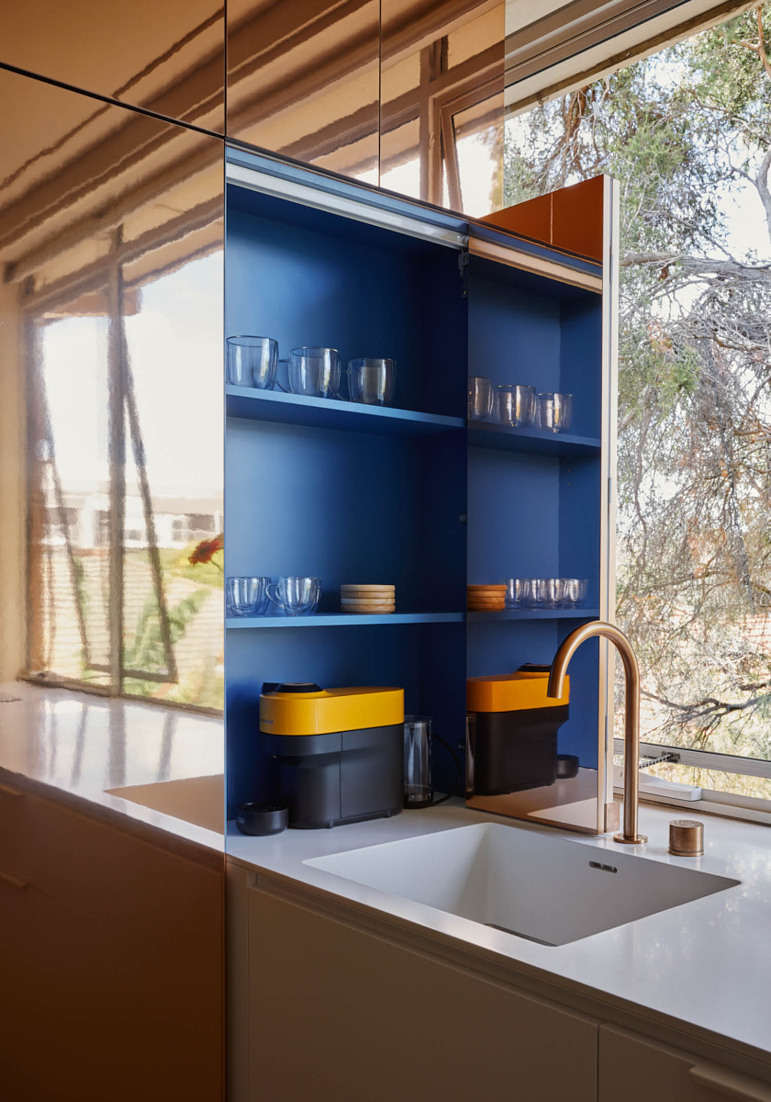
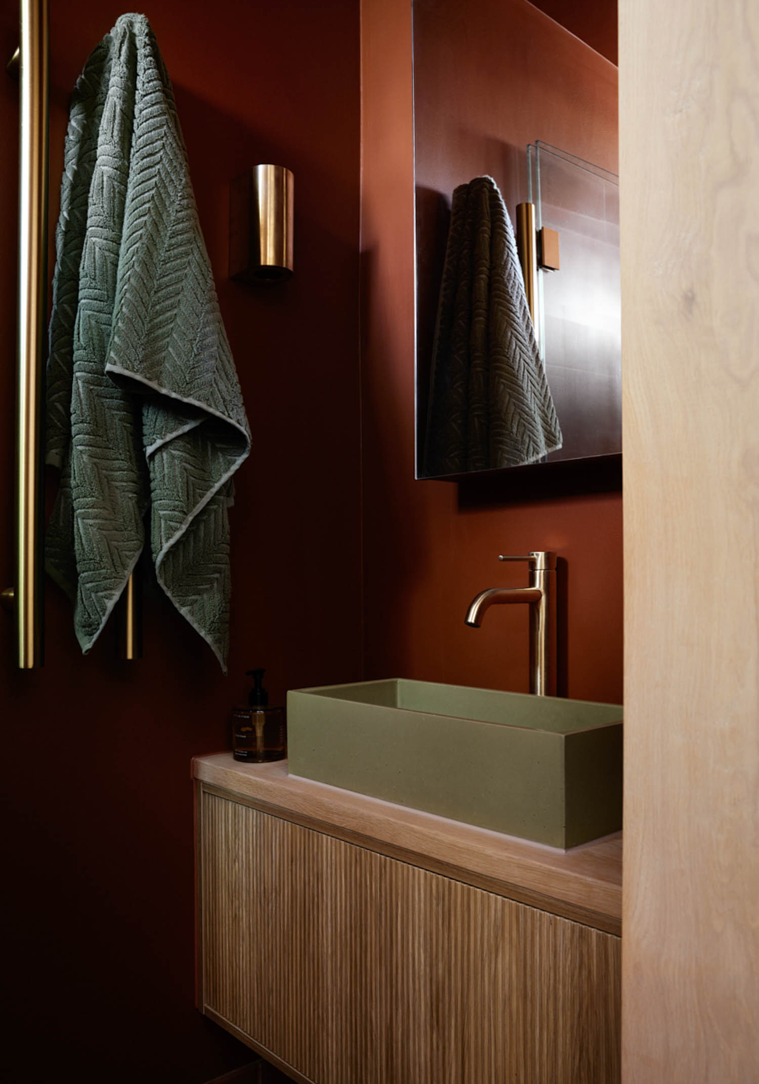
It was the client’s suggestion for the copper finish, they wanted something more dramatic, to make a strong visual impact for the guest the minute they walked through the door. With the copper selection, we extend the palette to the rest of the apartment, with the selection of tapware and fittings, it also inspires the terracotta finish to the bathroom.
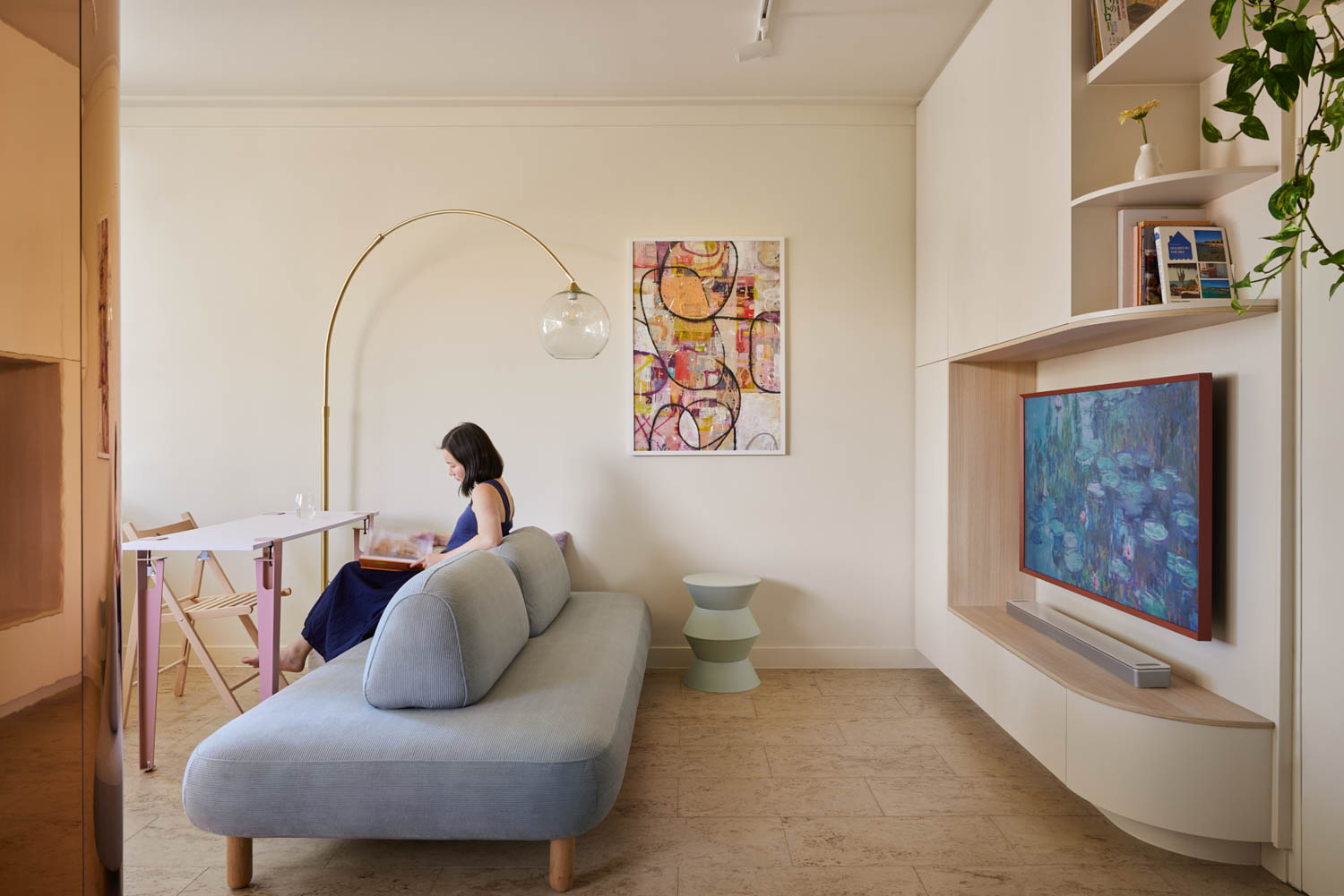
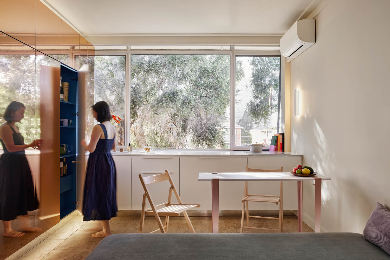
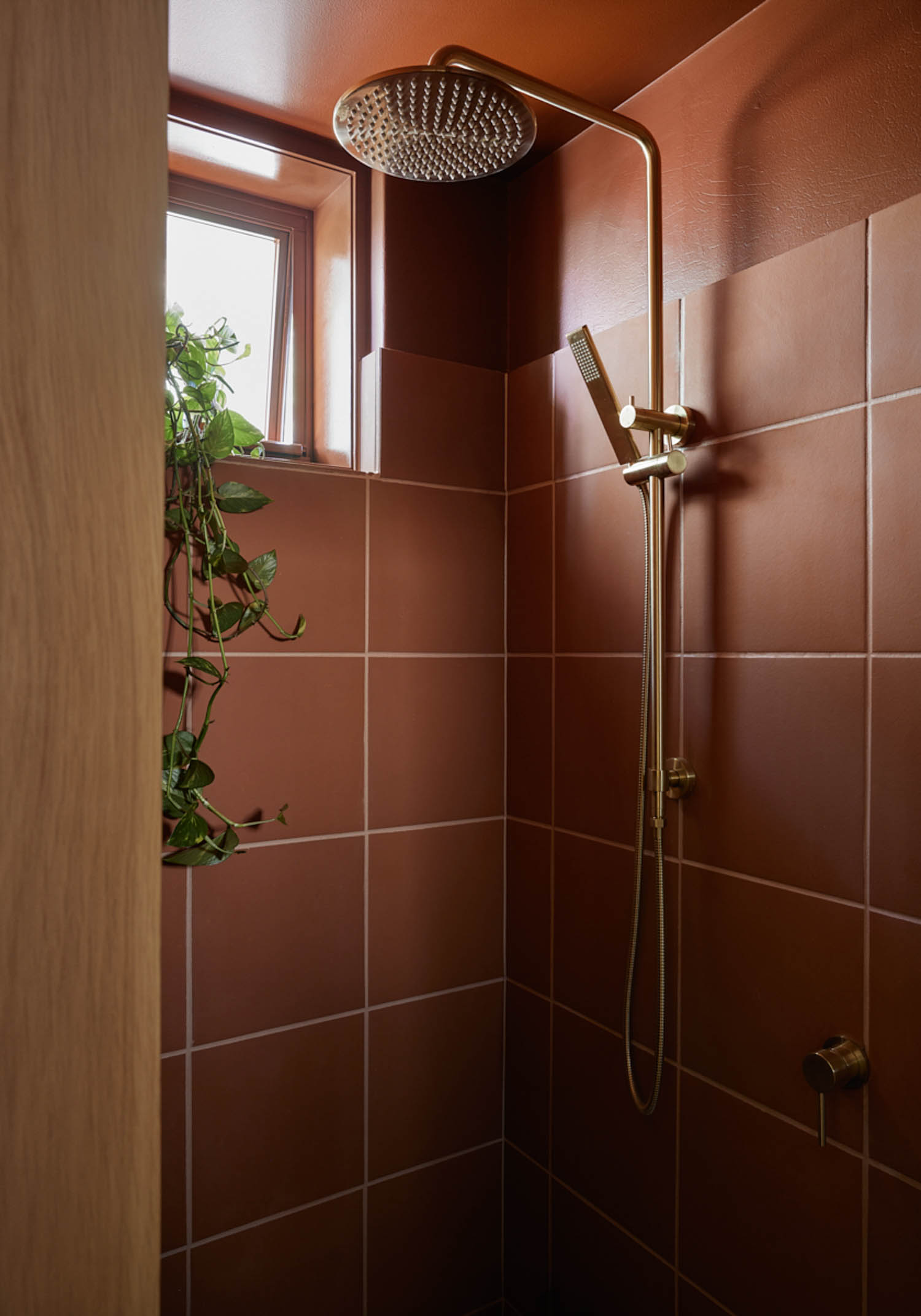
The interior of the bathroom pod features a dark and warm terracotta colour scheme, contrasting with the exterior. What was the inspiration behind this colour choice, and how does it contribute to the overall feel of the space?
Our material palette in most of our works to date are generally low key, and this includes this apartment (besides the copper pod), we wanted to add a warmth and strong contract to the rest of the apartment, adding a bit of drama when you open the bathroom door. The darker colour also leans into the fact the bathroom is very small, instead of trying to light it up to reveal how small it is, embrace it and make it feel cozy.
The sofa can be used from both sides to create separate living and dining areas. How did you approach the design of multifunctional furniture, and what other innovative furniture solutions did you incorporate?
The sofa is actually a find from the client, but I think it works really well, there’s a bit of a height difference between dining and living room sitting, so I think it’s important to acknowledge this and not expecting flexible furniture will provide the same comfort as traditionally laid out furniture.
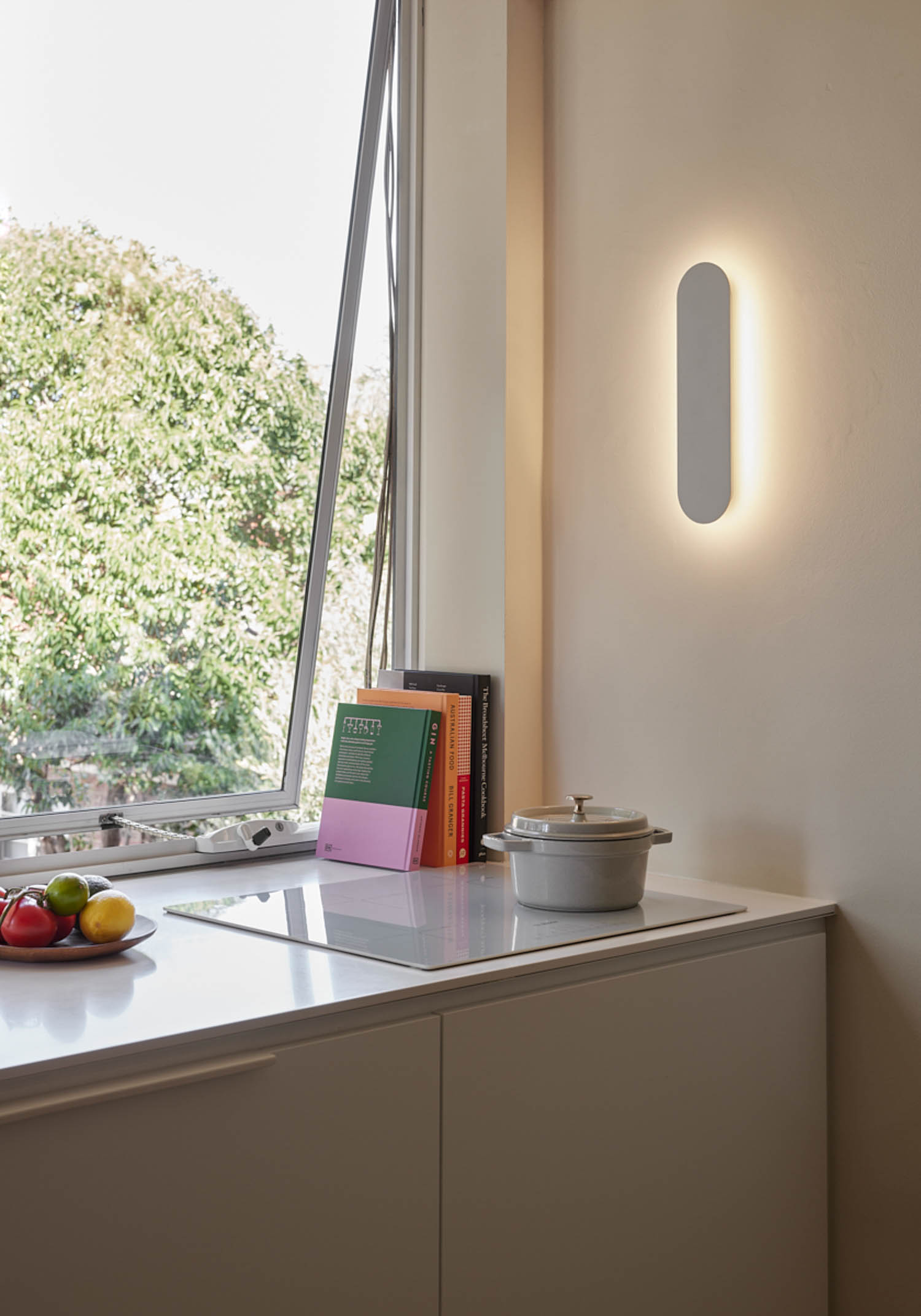
How did you balance the need for a stylish, appealing rental property with the practical needs of a home for the clients when they stay there?
I think the importance of storage space is key, so there is plenty of storage spaces, to hide and keep everything tidy, and very presentable as a furnished rental apartment, and contain everything the client needs for daily living.
What kind of innovations and trends are you seeing in micro apartment design? What is the context and appetite for this type of housing in Melbourne?
I’m not sure it’s a trend, but there is definitely a lift in quality of apartment designs, think people are stating to see the potential in them, and willing to invest. Which is great to see, as I really don’t see quality of living is determined by the size of the house you live in.
